Feedback on site changes Teruyo!Wo5j3FYZRg 2015/10/27 (Tue) 06:21
No. 13959
▼
File
144592689440.jpg
- (298.90KB,
1109x1000,
there must be wifi in the basement .jpg)

As some of you might have noticed, the site has a new front page and the default style has been changed from photon to chernobyl on boards. This is to make the site more accessible to newcomers but you'll be able to change the style to something else, as always, from the drop down menu at the top of every page.
There's a few changes that I plan on making to the site, including adding better support for small screens such as those on tablets and phones. The front page already scales nicely but rehauling the dusty old board code is an undertaking that will probably take me a while. I'm prioritizing something else at the moment, which I think everyone will be happy about. Nothing as visually dramatic, before you complain, and I promise it'll be good.
I plan on tweaking the front page some more in the coming days, fixing a few spacing issues and padding. But if there's anything else that you want to suggest that needs improvement or tweaking, I guess this is the thread for you. I'll promise to listen and tell you why or why not I can or cannot do something.
I'm also using the trip I use for writing as opposed to the admin identity because honestly it's less of a hassle not having to log in every time to post.
Anonymous 2015/10/27 (Tue) 06:50
No. 13960
▼
Why the default color change? Dark letters on a dark background makes reading stuff here a bit more difficult in my opinion.
Anonymous 2015/10/27 (Tue) 07:17
No. 13961
▼
I tried changing the page style since I don't really like Chernobyl, but for some reason the change doesn't stick when I change boards. Anyone know why is this? I'm using Chrome if it's of any help.
Anonymous 2015/10/27 (Tue) 08:38
No. 13962
▼
... there's a front page?
Also, Chernobyl theme sucks. Too washed out.
>>13961
>chrome
Well gee I wonder where the problem might lie.
Anonymous 2015/10/27 (Tue) 10:47
No. 13964
▼
Viewing from a phone right now - works perfectly.
Anonymous 2015/10/27 (Tue) 13:12
No. 13965
▼
Can't say I'm wild about Chernobyl either. Photon's the easiest theme on the eyes out of all of them. The front page redesign's pretty nice, though. Seems more readable somehow.
Anonymous
2015/10/27 (Tue) 13:17
No. 13966
▼
>>13962
Hey now...be nice. Not everyone is tech savvy enough to realize Google chrome installs multiple tools they can use to listen in on your home life, as well routinely submits user demographics and search histories back to Google in order to more finely turn advertisements.
Anonymous 2015/10/27 (Tue) 14:01
No. 13968
▼
HEY TERU, ON THE ISSUE OF CSS, THERE'S 0 SPACING BETWEEN THE "RECENT IMAGES" COLUMN AND THE BULLETIN POSTS. ADD SOME SPACING SO IT DOESN'T CLASH WITH MY EYES. ALSO THIS IS IN A WINDOW, GOOGLE CHROME CANARY.
ALSO, YOUR COLOR PALLET. IT'S NICE FOR NIGHT READING BUT IT'S COLD AND UNINVITING, KINDA LIKE YOUR LOVE LIFE. THE PREVIOUS DEFAULT PHOTON WAS BRIGHT, BLINDING, AND ORANGE, BUT IT WAS WARM AND FRIENDLY AND A GOOD FIT FOR THE FRONT PAGE.
AT LEAST GIVE US THE CSS OPTIONS AGAIN I MISS MY OLD THP, NEW THP SUCKS (IT'S LIKE NEW COKE).
Anonymous 2015/10/27 (Tue) 14:02
No. 13969
▼

>>13968
APPARENTLY, IF YOU'RE IN A FULL SCREEN BROWSER, THE SPACING ISSUE IS FIXED (CHROME CANARY AGAIN).
Teruyo!Wo5j3FYZRg 2015/10/27 (Tue) 14:40
No. 13970
▼
>>13960
I asked people who had never used the site before about the color scheme and they panned it universally. I wouldn't call black text on grey boxes dark though.
>>13961
Might be a cookie issue. Styles (and posting passwords for that matter) are stored by cookies on the site. If you're using private browsing or delete all cookies, then it would keep resetting. I try changes on all major browser engines.
>>13962
Yes, the front page exists and is actually important since a good chunk of hits go directly to it. So having a unified style across the boards that's both our own and not bright green is desirable. You're welcome to make something that isn't photon and has mass appeal. I'll add it - just like chernobyl and darkish were created by users years ago.
>>13965
I honestly think that people were just too used to photon to realize how grating it looks to a fresh pair of eyes. It'll always have a special spot in my heart but I honestly don't think it should be the default style.
>>13968
>>13969
The front page scales with the display area size. On larger resolutions it'll look like the second image. With smaller areas it'll look like the first image until it gets too small and switch to the mobile-friendly version. I'll be adding a few changes in the coming few days but it's unlikely to change too much. Adding spaces or gaps sacrifices legibility. It's a compromise between having all the information and looking okayish. If you want to have all the information without having to scrolling to the sides that's necessary.
The previous front page wasn't photon at all, it was just a mimic of (old) 4chan/futaba. If you want to have it as an alternate style sheet, go ahead and tweak the existing one's color and I will probably add it as an alternative.
Anonymous 2015/10/27 (Tue) 15:01
No. 13973
▼
>>13970
I'll have to agree that Photon was really harsh on the eyes, and I find Chernobyl a refreshing change. No problems reading here--- muted colours are friendly to the eyes.
Anonymous 2015/10/27 (Tue) 15:12
No. 13974
▼
File
144595877013.gif
- (158.65KB,
500x355,
8a1425f2ad84f004a2b60cbacfcda8f5.gif)

Isn't it ironic that the chernobyl theme is the one that stops making making my eyes bleed?
That is to say, I like the change and I appreciate the work that you're doing. Looking forward to the cellphone changes.
Anonymous
2015/10/27 (Tue) 23:18
No. 13977
▼
I can't understand why people don't love Burichan.
Anonymous
2015/10/28 (Wed) 02:05
No. 13982
▼
>>13977
I'm using Darkish because it reminds me of the
Princess Luna Color scheme on
FIMfiction.net
Anonymous 2015/10/28 (Wed) 02:27
No. 13983
▼
>>13970
>You're welcome to make something that isn't photon
But I like Photon. It's not bright at all, what the fuck are people talking about? I could paint the entire inside of my house with this colour scheme and it would be great.
Anonymous 2015/10/28 (Wed) 02:49
No. 13984
▼
>>13977
Bright colors destroy your eyesight. White is one of the worst.
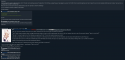
Moral!1d4WGijdSc 2015/10/28 (Wed) 08:56
No. 13987
▼
Hey all. Would you all be interested in a changed (but not necessarily better) Chernobyl? I'm no CSS or design expert, but feel free to look over the image attached.
Anonymous 2015/10/28 (Wed) 16:56
No. 13988
▼
I really like the recently posted-in threads being higher up on the front page. It just seemed weird having the recent activity be crammed on the bottom of the page and this is a lot easier to access and makes the site look more active
Anonymous 2015/10/28 (Wed) 20:11
No. 13989
▼
... There are people who use styles other than Futaba and Burichan? Wow. The other three look utterly garish to me.
Anyway, consider putting the recently updated stories list on every page? Either the whole list, or a link to it in one of the menubars. I know you probably want people to look at the front page more, but having the list only available there is lamesauce.
Oh, and if you want to go really fancy, how about a different border color on the boards for threads with new posts? Or for new posts themselves? Not sure how doable that is, though.
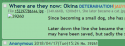
Moral!1d4WGijdSc 2015/10/30 (Fri) 05:19
No. 13994
▼
Update. I wanted to make a Darkish theme that actually wasn't literally black and white contrast. I was going for a softer look that didn't burn the eyes after an hour or so of browsing. What do you guys think?
Anonymous 2015/10/30 (Fri) 05:21
No. 13995
▼
>>13994
Needs more dog. I think it looks okay at a glance though, I might try it out some time if it becomes an option.
Isolex
2015/10/30 (Fri) 06:12
No. 13997
▼

Anonymous 2015/10/30 (Fri) 06:43
No. 13998
▼
>>13994
Not bad. I'll have it as an alternative
>>13997
Colorful and unobtrusive. A combination that's hard to get. Not sure I want Parsee to silently judge my posts though.
Isolex
2015/10/30 (Fri) 06:57
No. 13999
▼
Anonymous 2015/10/30 (Fri) 13:52
No. 14000
▼
Anonymous
2015/10/30 (Fri) 17:25
No. 14004
▼
This might not be the right thread, but here goes nothing.
I'm having some trouble with the site in FireFox on mobile. I dunno whether it's just something on my end, or if it's something with the site.
I tried with both Chrome and the default browser, and both displayed the site perfectly.
Saging because not feedback on changes to the site
SeibahIsMaiWaifu!B853n4Oiuk 2015/10/30 (Fri) 17:46
No. 14005
▼
http://pastebin.com/YKRPi6PV
Made a new variation using Solarized Light as a base.
It's styled around appearing like paper and should be easy on the eyes in daylight. I might update it a little more in the next week or so.
Anonymous 2015/10/30 (Fri) 17:52
No. 14006
▼
>>13987
Sure, I'm interested in best bird theme.
Anonymous 2015/10/30 (Fri) 19:37
No. 14007
▼
Decided to hop on the style train myself recently.
For anyone interested in a dark blue skin, this is based on Photon.
http://pastebin.com/bwVEMpTk
You might have go about specifying the URLs to point only toward storyboards.
Anonymous 2015/10/30 (Fri) 22:37
No. 14011
▼
>>13959
Thanks! Chernobyl as the default is a lot easier on the eyes. Somehow I never noticed that Photon had.
I'm excited seeing this place have updates... I want to tell all my friends about it now. Hm... I wonder if the boards themselves can be improved or something though? Not that there is anything wrong with them, but maybe there's something we just haven't noticed, like how nobody noticed that Photon was too grating.
Anonymous 2015/10/30 (Fri) 22:46
No. 14012
▼
>>14011
Working on your own CSS has become something of a fad in the IRC room. seems everyone is working on one.
Anonymous
2015/10/30 (Fri) 22:47
No. 14013
▼
>>14011
Actually, sorry for the double-post, but I thought of bringing up another old topic... So, to all of you lurking around:
Are we ever going to get a name besides "touhou-project.com"? I know, I know, we're all used to it and none of us are welcome to change/new things. But honestly? The lack of a unique name makes it hard for us to stand out. We don't have a super creative and interesting title that sticks to the brain, y'know? Plus, it renders recommendations directed at this site to become confusing.
If you're worried about the url changing, we could have a redirect to the new url, or alternatively, have a new url that redirects to touhou-project.com. Furthermore, we could come up with something that keeps the abbreviation "THP." I know some people have already come to calling this place all sorts of things that start with those letters. (Tea Hat Party is particularly popular.)
So yeah. Not sure if this is the right place to bring this up, but if we're trying to improve things around here, it's certainly the right time.
Teruyo!Wo5j3FYZRg 2015/10/30 (Fri) 23:12
No. 14014
▼
>>13989
The short version is: no, that's unlikely to happen.
The not-so-short version: The front page is made up of dynamic content (php). Every time you refresh it, it updates. The board pages are static (html) and are only refreshed when triggered, such as when someone posts. With javascript it's possible to make a script that fetches new elements and inserts them into a static page. But it's inefficient and clunky. There's newer server-side solutions too but to implement would require revising chunks of code and the underlying board software quite a bit, I think. We would be better off overhauling a lot more at once if that was the case.
I don't feel like typing out the more technical and detailed long version. Especially since I'm currently still trying to see what might work and what might not in regards to site improvements.
>>14004
I dunno what that's all about. Doesn't happen to me on FF or Fennec on android. BTW the burichan stylesheet has a few primitive workarounds for mobile that will probably get changed up and expanded upon. I just haven't gotten around to doing more yet.
>>14011
There's a few things I have planned for the site that ideally will be done in the next couple of weeks. Beyond that I think that we'd need to do more dramatic changes to the board software that will likely require a lot of time and patience. The thing is that I have to do all of this in my spare time as it's very much a hobby. So when life is being life I don't always have the spare time, peace of mind or motivation to work on improvements. I'd much rather give priority to writing since that's more fun and I want to keep up my fast daily pace. This is why the css tweaks haven't happened yet - I was thinking of doing it yesterday but stuff came up.
I'd appreciate it if you did tell your friends about the site, though. We do need new blood and any and all promotion is a good thing.
>>14013
I'm not against having a different name or buying another domain. That's a discussion the community needs to have and decide upon. I don't want to force anything. If you have anything specific you'd like to run by me in private, you can find me on IRC.
Anonymous 2015/10/31 (Sat) 02:40
No. 14016
▼
I find the radiation sign in the bottom right distracting. As lovely as Okuu is, it's... on the nose.
Anonymous 2015/10/31 (Sat) 13:51
No. 14018
▼
Hey, ah, this is an awkward question, but... I can't find the IRC chat without the sidebar, noob that I am... How do I find it now?
Anonymous
2015/10/31 (Sat) 14:31
No. 14019
▼
>>14018
Front page, 5th tab at the top.
Anonymous
2015/10/31 (Sat) 16:22
No. 14020
▼
>>14019
You're a real (nationality of choice) hero, you know that? Thank you.
Anonymous 2015/11/02 (Mon) 18:34
No. 14034
▼
Made a dark theme that follows my firefox style, based off of the nice darkish css from
>>14007
What do you guy's think?
Also, if anyone knows how to change the hover colours for post numbers and backlinks I would really appreciate it if you shared~
http://pastebin.com/Ctq5Y8dF
Anonymous 2015/11/02 (Mon) 20:10
No. 14035
▼
Quick update to
>>14034 since I realised that the front page wasn't fully styled and looked pretty poor as a result, fiddled with it a bit until I got pic related
http://pastebin.com/wyn310wu
Anonymous 2015/11/02 (Mon) 21:48
No. 14036
▼
>>14034
>>14035
Not bad, friend. I really like the green on that style.
As for the front page, I got too lazy and just turned off the style for it. Good on you for fixing it~
Anonymous 2015/11/07 (Sat) 05:50
No. 14064
▼
>>14016
This. I like the Chernobyl theme for the most part, but I dislike having icons in the background.
Anonymous 2015/11/26 (Thu) 17:38
No. 14071
▼
I dropped by to visit after a long time off, and I'm amazed at the new front page. It's much cleaner and more professional-looking now.
The site overall is just plain fabulous, as well!
Good Job, Teruyo!
Moral!1d4WGijdSc 2016/03/28 (Mon) 14:49
No. 14131
▼

Anonymous 2016/03/28 (Mon) 16:12
No. 14132
▼

>>14131
This is how it looks to me.
If I had to nitpick, I'd say the greentext isn't distinguishable enough from normal text, which defeats its purpose. Other than that, it works well.
Moral
!1d4WGijdSc 2016/03/29 (Tue) 00:22
No. 14133
▼
>>14131
Some news. The style may not show up due to HTTPS. If you are browsing in HTTPS, make sure to edit the url-prefixes in the CSS source code accordingly.
Anonymous
2016/03/29 (Tue) 00:49
No. 14134
▼
>>14132
making that fucking groove picture made me laugh uncontrollably for like five minutes, and the utter lack of reaction towards it angers me immensely
Anonymous
2016/03/29 (Tue) 02:18
No. 14135
▼
>>14132
You've gotta' admit, that joke wasn't really all that groovy.
Anonymous 2016/03/29 (Tue) 02:23
No. 14136
▼
>>14131
IRC isn't busted for anybody else, is it? If it is, is it because of site changes?
Anonymous 2016/03/29 (Tue) 03:02
No. 14137
▼
>>14136
No and no. That being said, you shouldn't use the site's embedded IRC. Use a standalone client.
Teruyo!Wo5j3FYZRg 2016/03/29 (Tue) 03:05
No. 14138
▼
>>14136
Apparently Mibbit doesn't serve https in its widgets unless you pay for it, so I've switched it over to kiwi irc. Should be fine now.
Anonymous 2016/03/29 (Tue) 10:30
No. 14139
▼
Anonymous 2016/03/31 (Thu) 04:13
No. 14140
▼
Is there any way to not browse in HTTPS? It defeats my proxy and is generally slower over my shitty connection.
Anonymous 2016/04/01 (Fri) 04:27
No. 14141
▼
>>14133
Speaking of which. The archived stories (possibly only older ones?) reference their stylesheets and scripts as HTTP, even when the page itself is now being served over HTTPS. Security flags get tripped everywhere, and nothing gets loaded.
By default this only happens for me on Chrome because Chrome sends an 'Upgrade-Insecure-Requests' header, which the server cheerfully acquiesces to. (Firefox will do the same thing soon, if it doesn't already: see FF bug 1243586. I may just need to upgrade.) This wouldn't be a problem if the server also sent the 'upgrade-insecure-requests' CSP directive* in return, but it doesn't.
* ("hey, browser, just pretend all the links and stuff in this thing are https, 'kay? thanks")
>>14140
I suppose you could find some way to disable or strip the Upgrade-Insecure-Requests header on your end. It's almost certainly a terrible idea, but it's at least theoretically possible. (It'd be far better to fix your proxy setup to work with HTTPS, though.)
Anonymous 2016/04/12 (Tue) 17:34
No. 14150
▼
File
146048247235.png
- (175.59KB,
2560x1440,
tmp_7603-Screenshot_2016-04-12-13-14-52-745461400.png)

Teruyo, what's up with this? I'm getting these left and right everytime I do anything. I had like three just trying to make the damn sadness thread last night, and I can't even load the homepage unless I switch to mobile data, else I get these errors.
Teruyo!Wo5j3FYZRg 2016/04/12 (Tue) 18:53
No. 14152
▼
>>14150
Dunno man, not sure what's wrong there. It ought to be working on virtually every modern browser and OS. In the months before the change, I made sure to test on as many browsers and OSes as possible. Can't reproduce that error with firefox on my android phone. Could you tell me what it says under 'Technical Details'? In fact, tell me more about your setup such as OS and browser versions while you're at it. Feel free to talk to me on IRC about this too, since it might be faster to figure out in real time.
Anonymous 2016/04/12 (Tue) 21:07
No. 14153
▼
>>14152
I'll not be home for another twelve hours ish, but until then I can tell you that I have FireFox v. 45.0.1, and am running OS version 45.0.1 on a pretty much new Driod Turbo 2. I'll get the technical details when I'm able to connect to my wifi again, but I can tell you that there wasn't any sort of "proceed" option on that screen,just some form of error I believe it was. In hindsight I really should have screenshot-ed the tech bit too before leaving.
Anonymous 2016/04/12 (Tue) 21:08
No. 14154
▼
>>14153
*OS 5.1.1,I don't even know how that typo happened
Anonymous 2016/04/13 (Wed) 11:43
No. 14155
▼
File
146054780075.png
- (281.42KB,
1440x2560,
tmp_20722-Screenshot_2016-04-13-07-38-411147692493.png)
Teruyo, it's happened again. Here's the full thing this time.
Well that happened. I was trying to post this and suddenly my whole phone locked up and avast, MediaMonkey, and Firefox itself all crashed. What the hell phone why do you do this to me?
Teruyo
!Wo5j3FYZRg 2016/04/13 (Wed) 14:45
No. 14156
▼
>>14155
Unfortunately that's about as generic of an error message as it gets. And, since I can't reproduce the bug nor find something obviously wrong with your setup given the information you've given, I'm limited in what I can reasonably do. SSL/TLS is the kind of thing that's obvious if it isn't working right because both server software and browsers yell bloody murder if any one thing is misconfigured.
All of that said, I did tweak a few small things on intuition that
ideally won't break anything for anyone else. Let me know if it still hangs for you. And, if it does, if the behavior persists with another mobile browser. Firefox is the strictest in some regards when it comes to defaults for encryption (which makes it all the more weird that I can't repro on either desktop or mobile as it's my primary browser).
Anonymous 2016/04/13 (Wed) 15:39
No. 14157
▼
>>14156
Thanks for the effort Teruyo, but I had it again as I was loading this thread to read your reply. At this point in inclined to believe that it's something on my end messing things up. Before I post this I'll try to load a few boards through overchan and dolphin to see if either of them work where firefox doesn't.
Yeah, dolphin pretty much confirmed that it's on my end. Fucking fortiguard fucking sucks. I don't know why fortiguard doesn't give a blocked page for Firefox, but on dolphin your wonderful site is blocked under pornography. I'll be seeing about getting that shit removed ASAP. By the way, I wish all admins and customer service people were as prompt and helpful as you are.
Teruyo!Wo5j3FYZRg 2016/04/13 (Wed) 16:22
No. 14158
▼

>>14157
>fortiguard
So are you being filtered by your network or is it a service you have on your phone? If it's a program you have, try disabling it before trying with firefox again. It may be their blocking of the domain that's messing with ssl being accepted as valid on firefox and causing all sorts of craziness.
Also, we totally are a pornographic site so I don't think any appeal will be successful. /at/ aside, there's erotic stuff in stories all the time and that counts insofar these services are concerned. Usually these filters are dns-based, so just for browsing using the IP address in the url bar instead of the domain name gets around the issue.
All this talk of mobile browsing reminds me of my huge to-do list for the site which I've ignored for months. Posting an image of a touhou is easier than actually doing any work, so I'll do just that.
Anonymous
2016/04/13 (Wed) 17:55
No. 14159
▼
>>14158
>Posting an image of a touhou is easier than actually doing any work, so I'll do just that.
people like you are the reason why writers stop updating
Anonymous 2016/04/13 (Wed) 20:40
No. 14161
▼
>>14158
>pornographic site
The fuck you talk about, this isn't
porn, it's art. Why, just look at Scorn's old stuff. You can't tell me that's not artistic. Eh, I'll just Orfox my way through it, it's a network thing. I didn't want to use it because it fucking destroys my battery, but sacrifices must be made for the 2hus.
>posting a picture of a touhou is easier than doing any of that work
Teruyo plz.
Teruyo
!Wo5j3FYZRg 2016/04/13 (Wed) 22:40
No. 14162
▼

>>14159
Getting a writer to update is pretty easy though. You just remind them that you're eager to read more, offer a few good 2hu images as tribute and he's sure to feel inspired. Failing that, you can always
call him a lazy faggot that needs to get back to the plottan' fields. Even if he tells you to sod off, it's still better than no communication.
>>14161
For you, my friend, another image. It's the
least I can do.
Anonymous
2016/04/14 (Thu) 01:41
No. 14163
▼

>>14162
Well at least it's Yuuka. Speaking of writing, I can't help but notice
that you have this one story in /others/ that hasn't been updated since Christmas. Nigger, work, back to it, etc. It's been too long since I've read your things so I've forgotten your favorite 2hu, so have some happy triclops.
Teruyo
!Wo5j3FYZRg 2016/04/14 (Thu) 03:01
No. 14164
▼

>>14163
Satori is alright but does little to set things in motion. Considering that it took around 3 months after my last post to get enough votes to continue, I'd say that there's a distinct lack of interest in my writing. And I can't resume a story with daily updates like it's intended to be run without readers, their interest and - most importantly - their votes. Out of my hands for the most part, I'm afraid.
More in-depth discussion about me, my stories and whatever else ought to be in some other thread. Let's keep this mostly about the site and the stuff that gets worked on.
That said: have yet another image because, why not?
Teru help ;_; Anonymous 2016/05/29 (Sun) 21:00
No. 14235
▼
Suddenly my phone is rendering the sites format like pic related. I use the Dolphin browser. Do you have any idea why this is happening?
Anonymous
2016/05/29 (Sun) 21:51
No. 14236
▼
>>14235
>Reading YAF
Even your browser knows better.
Anonymous 2016/05/29 (Sun) 23:35
No. 14238
▼
>>14236
Why is Blue nestled between /at/ and /words/ when I browse /th/, but nowhere else?
Anonymous
2016/05/29 (Sun) 23:37
No. 14239
▼
>>14238
Whoops, didnt mean to quote
Teruyo!Wo5j3FYZRg 2016/05/30 (Mon) 01:25
No. 14240
▼
>>14235
dunno, can't repro. Thought it might be a css thing but it loads up fine for me at various resolutions.
>>14238
moved categories. /blue/ really didn't need to be a special snowflake considering its sister boards are long since dead.
Also, tweaked the front page a little more and should have a bit more consistent behavior. Still have more work to do on it but probably won't be done anytime soon.
Anonymous 2016/05/31 (Tue) 05:04
No. 14242
▼
>hiding a thread on /th/, /eientei/ and /border/ makes all threads beneath it vanish entirely
>this doesn't happen on other boards
how do you even
Anonymous 2016/05/31 (Tue) 05:06
No. 14243
▼
>>14242
Oh, it also happens here, /blue/, and /at/.
I mean seriously what the fuck.
Anonymous 2016/05/31 (Tue) 05:30
No. 14244
▼
The thread hider is currently acting weird on /at/, /blue/, /th/, /eientei/, /border/, and /others/. Hidden threads prevent scrolling, and hiding the top thread hides the entire board.
Anonymous 2016/06/07 (Tue) 17:29
No. 14254
▼

Teruyo, is there a way to move the "Hide watched threads" and "Refresh watched threads" icons at the top of the watched threads box like in pic related? Because right now it causes trouble with the links. I know I can just extend the box, but without that icons I can put more threads in less space. Thanks in advance and sorry for bad english.
Anonymous 2016/06/07 (Tue) 23:26
No. 14260
▼
>>14238
The reason it's inconsistent between boards is because no one has posted on some of the boards since Teruyo changed it, and that's necessary to see the new location.
Specifically, the server generates HTML whenever a post is made, and keeps that until a new post is made. There's no point in re-generating the webpage if nothing has changed after all... but some things, like moving the boards around, don't trigger the update.
Teruyo
!Wo5j3FYZRg 2016/06/08 (Wed) 04:44
No. 14261
▼
>>14254
Done. Hope no one complains the change. And that's perfectly fine English, don't worry.
Anonymous 2016/06/14 (Tue) 20:21
No. 14273
▼
Teruyo is it normal that every time I shut off my pc my list of watched threads vanishes? The box remains there but it's empty, I have to add them again every time. I'm using chrome and I haven't cancelled the cookies...
Anonymous 2016/06/16 (Thu) 16:18
No. 14276
▼
>>14273
You've probably got something changing your IP, if I had to guess - personally I've found that my watched threads seem to vanish and reappear as I move between internet connections.
Hell if I know why it's IP-specific, though.
DAMN YOU IRC Anonymous 2016/07/11 (Mon) 00:32
No. 14293
▼
I can't connect to IRC. I keep getting an "ECONNREFUSED" error. Is this a problem on my end, was there a recent change or what?
Teruyo
!Wo5j3FYZRg 2016/07/11 (Mon) 20:21
No. 14296
▼
>>14293
With the kiwi web client on the front page? It works for me.
Anonymous 2016/09/17 (Sat) 04:36
No. 14373
▼

So, I vaguely remember someone at some point making a comment about there being more "color" boards than just /blue/ and /coriander/ and I decided to try some. Can someone tell me why, out of all the ROYGBIV colors, does Inidgo have a different colored 404 screen than the others?
Moral
!1d4WGijdSc 2016/09/18 (Sun) 07:30
No. 14382
▼
>>14373
You're using the night theme, aren't you? The color scheme is identical to the night theme. I don't know why, but I experience the same issue as well. Things like /red/ are normal, but /indigo/ is included in the css's criteria, somehow.
I blame not using regex.
Read
2016/09/18 (Sun) 07:45
No. 14384
▼
>>14382
I'm using the one you sent me, can't remember the name.
Anonymous
2016/09/19 (Mon) 17:11
No. 14406
▼

Teruyo!Wo5j3FYZRg 2017/04/04 (Tue) 17:58
No. 14772
▼
Added a pair of new themes, dusk and photon dark blue. They were made by two of our moderators, Moral and Alkarl. Pretty good stuff if you're into dark themes.
Anonymous 2017/04/05 (Wed) 01:52
No. 14774
▼
>>13994
Dusk needs the best awoo image to work.
Also, I tried Isolex's (hard to find a image background that isn't intrusive) but it has errors (a few 'empty rules' whatever that is) but with my luck he's already disappeared from the face of the Earth.
Mobile Accessibility Teruyo!Wo5j3FYZRg 2017/06/04 (Sun) 18:04
No. 14937
▼
I've added a "beta" CSS theme alongside a few tweaks on the board pages that should make the site a better experience for any mobile/small screen users. There are some things that are still rough around the edges/purposefully left unfinished such as:
-navigating between boards (will likely be a drop down menu)
-navigating between board pages (same)
-switching between CSS themes (that drop down menu will probably be moved/put next to the navigation one)
-a few misc positioning of items, like the posting mode indicator above the postbox
-actually switching in and out mobile view automatically on a first time visit
Those will be handled later after I get the more important bits ironed out. And that's where I need people who often use their phones to browse the site to pipe in. Select the 'mobile' CSS from the style selector and give me feedback on things like:
-Proportions of font sizes
-Spacing between elements
-Ease of navigation
-whether logos should be cropped/gotten rid of
-general usability/legibility
If something looks off please go into detail about what it is and how you think it can be improved. A screenshot is also potentially very helpful. I'm not exactly an expert on UI and aesthetics so I value any and all input. There's a lot that can use tweaking.
Make sure to mention if you're running an unusual resolution or something too. If you need to exit the CSS, there's a button on the bottom left of the page that should reset it back to chernobyl.
Normal desktop users: it'll obviously look weird for you guys, so don't bother looking with large viewing ports.
Anonymous 2017/06/06 (Tue) 22:53
No. 14939
▼
First of all, thank you. I do most of my reading on mobile, and now I can actually read the text without zooming in or switching to landscape. The screenshot is on a 5" 1080x1920 phone, so you can resize it on your computer for reference.
>Proportions of font sizes
The thread titles/names are tiny, especially relative to the new post text size.
>Spacing between elements
It looks good to me.
>Ease of navigation
Most of the links are too small to tap properly. Currently, I have to zoom in on the list of boards to make sure I hit the right one.
>whether logos should be cropped/gotten rid of
I'm going to assume you mean the page banner. Those are fine, but I'd rather they not overlap with the watched threads box. Maybe you could re-size them to fill the width of the screen?
>general usability/legibility
I can read the text of posts. Everything else is secondary.
Wishlist:
-The list of boards or the menu icon should float on the page as you scroll down.
-Larger image thumbnails would be nice.
-A notification on the menu bar if a watched thread on one of the boards has been updated would be amazing, but that's an unrealistic 'stretch goal'.
Anonymous
2017/06/07 (Wed) 00:47
No. 14940
▼
>>14939
>A notification on the menu bar if a watched thread on one of the boards has been updated would be amazing, but that's an unrealistic 'stretch goal'.
That just sounds wonderful in general. Heck, even just changing the color of a board's name to show that it's the case would be wonderful.
Teruyo!Wo5j3FYZRg 2017/06/07 (Wed) 03:47
No. 14941
▼
>>14939
Thanks for the feedback. I'm just replying to highlights where I can add clarity. In general, assume that I'm taking into consideration everything anyone posts in this thread.
>The thread titles/names are tiny
I generally agree. But this is something that may or may not change depending on how it looks on smaller resolutions (say, on slightly older phones).
>Most of the links are too small to tap properly.
Is this the case for links within the threads themselves (ie: links to other threads or external such as the pastebin link a few posts above)? That's more important to get right. I'm not concerned with the board list because that's just there temporarily.
>watched threads box.
You can resize and drag the WT box. Try that. It's otherwise not something I'll be taking into account right now and I've hidden away the button for it in the mobile css to begin with while I work out how board/css selection will work.
>The list of boards or the menu icon should float on the page as you scroll down.
This is the solution I had in mind and am looking to implement. It's not a guarantee and I may just go with static dropdown menus at the top and bottom. There's factors such as rendering times and page complexity to take into account. Too many bells and whistles and pages take too long to load and may not work properly on less modern devices. How the page is served was something designed over a decade ago and right now I'm working around limitations in a somewhat ugly way. I'm not prepared to do a partial or full rewrite right now because, when I do, I might as well change most of the backend stuff on the site.
>Larger image thumbnails would be nice.
Not going to happen, sorry. Would have to change too much old code around and how thumbnails are generated in the first place.
>notification on the menu bar if a watched thread on one of the boards has been updated
Not going to happen either. An overhaul of the WT functionality is something I had in mind but it's something relatively low priority. The mystery box, mobile stuff and a few other things all take precedence.
Anonymous 2017/06/07 (Wed) 13:22
No. 14942
▼
>>14941
>small links
It's mostly the [Reply] link at the top of each thread, but it's pretty easy to fatfinger the image/image expand as well. Also, the link in "message too long, click [here]" is smaller than the rest of the text in that sentence. On the rare occasion that someone does two 'above posts' links one after the other, it can be difficult to tap the right one. The same applies to posts with multiple 'replies' links, but that is less important.
>resize WT box
I can resize it on my desktop, but not on my phone. I'm not in the habit of using it anyway; I just figured I should test everthing on the site.
>stuff that can't be done
I understand. There's only so much that you can do with CSS, and legacy systems are suffering.
Anonymous 2017/08/23 (Wed) 19:40
No. 15099
▼

I think this is the most relevant thread to post my problem.
I can post images on /blue/ but not /others/. Tried it on my desktop (Chrome) and my phone (Safari). The error that comes up is "could not create thumbnail" and at the very top it says "unable to imagejpg."
Let's see if a screenshot of the error will post here...
Anonymous 2017/08/23 (Wed) 19:42
No. 15100
▼
>>15099
Isn't the image just in use already on others but not blue?
Anonymous 2017/08/23 (Wed) 19:50
No. 15101
▼
>>15100
I tried four different images, including the error screenshot I just posted. They all give me the same error.
Teruyo!Wo5j3FYZRg 2017/08/23 (Wed) 20:19
No. 15102
▼
Anonymous 2017/08/23 (Wed) 20:29
No. 15103
▼
Anonymous 2017/10/06 (Fri) 19:33
No. 15137
▼
I might as well post this here.
RSS feeds have been spotty or just not working at all for the past week or two on most of the boards. /th/, /eientei/, /others/, and /blue/ seem to be working fine; the rest are borked.
Anonymous
2017/10/06 (Fri) 19:39
No. 15138
▼
>>15137
This post showed up, though. Maybe it varies per thread.
Teruyo!Wo5j3FYZRg 2017/10/06 (Fri) 20:15
No. 15140
▼
>>15137
I haven't touched site code or server software in that time. I've subscribed to a few boards now to see if it works for me, but it seems fine so far. Would appreciate others weighing in.
Anonymous 2017/10/06 (Fri) 21:48
No. 15141
▼
>>15139
I, too, have subscriptions working.
>>15138
Have you tried reclicking the WT button?
Anonymous
2017/10/06 (Fri) 22:03
No. 15142
▼
>>15140
Must be a problem with my own client, then.
Teruyo!Wo5j3FYZRg 2017/10/25 (Wed) 18:47
No. 15197
▼
Alright, so I've finally gotten closer to finalizing the mobile stuff for the site. The way it works now is that you can click on the "[Switch to Mobile Page]" bit on the bottom of any page to switch to the mobile view. Alternatively, the first time you visit the front page with a mobile device, it should automatically set the cookie needed for mobile view without you needing to do anything else (it doesn't set it again if you've explicitly opted out via hitting "Switch to Desktop Page" at the bottom).
There's a navigation bar that displays on top/scrolling up and you can switch to whatever css theme you like and it shouldn't make a difference.
As before, I'm looking for feedback on usability and whether there are any bugs encountered. Screenshot and/or resolution specifications are useful to me when suggesting tweaks. I obviously don't have that great a sense of aesthetic, so speak up or otherwise nothing will be changed. Don't be lazy, either. I know for a fact that there's a fair proportion of mobile users on the site. If there's no feedback in a while, I'll just assume all is good and move on to other stuff.
Things I already know about/am not touching right now:
-Watched threads in mobile view
-background color of navigation menu
-size of thumbnails
-mobile view not working on /i/ or the text board
Anonymous 2017/10/26 (Thu) 13:13
No. 15198
▼
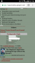
File
150902363080.png
- (312.59KB,
293x500,
you versus the pet she tells you not to worry abou.png)

>>15197
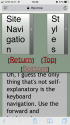
Good work! I've checked it out today and it looks good. Bigger buttons are always helpful but... could you try to make the "Top" and "Bottom" buttons from the end of the page to be the same size as the ones from the top?
The 'Site Navigation' menu seems hard to hit and those pop up things are not my cup of tea, but I use a very old cellphone (Moto G) so I doubt my opinion is shared by many, if at all.
Selecting a post's number only works as usual if the reply box is open. If it is closed, it alternates between deleting the 'No' and the 'Number' part. I expected it to send me back to the top and open the reply window. If it is intended, then nevermind.
Is it possible to make the 'reply' box follow you around if activated? Sometimes, you want to make a point-by-point reply and I really don't want to alternate between the top of the page and wherever the post I'm replying to is.
Finally, and this might be unrelated, but I was using the .thp site to escape my work's proxy... but now the site is not filtered anymore. Did you do any changes related to that or my filter fucked up? Either way: happiness!
Anonymous 2017/10/28 (Sat) 14:34
No. 15199
▼
>>15197
iPhone 6 here. Personally, I feel like the font size could be boosted on everything. Maybe it's just my aging eyes, but posts are just a tad hard to read. Additionally, the font size seems to vary between posts, so some show up smaller than others for some reason.
As to the navigation bar, I agree with the above anon that it's a little fiddly. Maybe it could just be persistent? It's also way too small, in my opinion. Another thing is a slight bug with it where going to another page, hitting Back, and selecting Site Navigation gives a 404. Lastly, it could probably use top and bottom buttons; the normal ones are small and awkward to hit without zooming in, and I use them a lot.
Ditto on reply weirdness described above. It doesn't seem to be inserting the post number at all in my experience.
Not a mobile thing, but I didn't know where else to address it: The Home button on the desktop site takes me to the Touhou-Project even when I'm on THP.moe. Not a huge deal but a bit of a gripe because I prefer the latter.
Anonymous
2017/10/28 (Sat) 14:36
No. 15200
▼
>>15199
Addendum to the domain issue: When I posted just now, it redirected me to /gensokyo/ on Touhou-Project instead of THP.moe.
Anonymous
2017/10/28 (Sat) 14:39
No. 15201
▼
>>15200
Addendum to the addendum: I just noticed that changing pages on any given board seems to redirect as well.
Teruyo!Wo5j3FYZRg 2017/11/02 (Thu) 18:40
No. 15211
▼
>>15198
>"Top" and "Bottom" buttons from the end of the page to be the same size
Have removed them altogether, in the sticky menu now. Let me know if that's better or not.
>Selecting a post's number only works as usual if the reply box is open.
It opens up the reply box now and scrolls up.
>it alternates between deleting the 'No' and the 'Number' part.
Actually a separate issue, but fixed all the same.
>Is it possible to make the 'reply' box follow you around if activated?
Not at the moment. I'm trying to keep things simple code-wise because of various reasons. Maybe in the distant future, after a few other site things are taken care of.
>not filtered anymore
That's not up to me.
>>15199
>font size could be boosted
This is something that I'd rather have more people chime in on before changing any more.
>the font size seems to vary between posts
That shouldn't happen and I haven't observed it or been able to reproduce. Anyone else confirm? Failing that, any special details about your setup?
>hitting Back, and selecting Site Navigation gives a 404
Hopefully worked around.
>The Home button on the desktop site takes me to the Touhou-Project even when I'm on THP.moe.
sadly a lot of the board software creates hardcoded links. I was aware of this but it doesn't have a straightforward solution. Also happens with posting and changing pages as you have noticed. I want to fix that in a non-hacky way if possible but because of that it's a lower priority to other things.
Anyhow, please give feedback on the latest changes, I'm sure that it can use a lot more tweaking. Browser-based test tools I have access too can't capture all the idiosyncratic behavior of real mobile devices.
Anonymous 2017/11/02 (Thu) 20:07
No. 15212
▼
>>15211
>That shouldn't happen and I haven't observed it or been able to reproduce.
Attached screencap. It might not be super clear, but there is a difference in the font sizes.
>Failing that, any special details about your setup?
The screencap's from Safari, but I was observing it in Firefox iOS 9.2 as well. On an iPhone 6 running iOS 11.0.3.
>feedback
Can confirm that the navigation issues have been fixed and that the reply box/replying behaves as intended. The size of the navbar is a lot better, and the additional buttons improve things considerably. The element/font size (scaling? I guess the site is meant to be at least somewhat responsive) issue aside, it's pretty usable now.
One minor gripe: Are /at/ and /blue/ missing from the navmenu on purpose or is that an issue with the setup?
Anonymous
2017/11/02 (Thu) 20:09
No. 15213
▼
I realised after taking the last screencap that it doesn't seem to be just fonts that do this weird scaling thing. This one's from Firefox.
Teruyo!Wo5j3FYZRg 2017/11/02 (Thu) 20:41
No. 15214
▼
>>15212
>>15213
>/at/ and /blue/ missing
Oversight by me, fixed.
>font size issues
The fact that it happens on the storylist as well leads me to believe that it isn't the fault of the new stuff I've rolled out, as I haven't touched the storylist page at all. It may be an ios-specific issue or something particular to your device. Not discarding the possibility that there's something that needs fiddling the site's end and I'm going to see what I can find but, honestly, I have no clue where to start. This doesn't happen on any other site? In the non-mobile view?
Anonymous
2017/11/02 (Thu) 23:39
No. 15215
▼
>>15214
>This doesn't happen on any other site? In the non-mobile view?
I went and checked a few other sites, including other imageboards; this was the only one that exhibited that behaviour. However, I did note that switching to desktop mode here showed the same issue. Not sure what conclusions to draw there, but there you have it.
Anonymous
2017/11/04 (Sat) 16:15
No. 15216
▼
>>15214
the font thing isn't new at all, it's been a thing since early 2015 at least
Anonymous 2017/11/08 (Wed) 06:10
No. 15217
▼

All the posts look like this to me, and the site starts zoomed in so they fit the screen, which is fine, except they don't resize back to fill it once I zoom out.
Teruyo!Wo5j3FYZRg 2017/11/08 (Wed) 07:53
No. 15218
▼
>>15217
Which browser is that? I think that may only happen on chrome/blink-based browsers that I can see but I would like to make sure. Try Firefox (preferably, but if you try any other non-blink based browser that can also help) if you can as well, please, would help me narrow down problems.
>>15216
With iOS, safari? Some other setup? More info helps me narrow down potential causes.
Teruyo
!Wo5j3FYZRg 2017/11/08 (Wed) 09:13
No. 15219
▼
>>15218
Eh, whatever, I think I've worked around it with the CSS equivalent of nuking from orbit + a little tweak in a script.
I'm still interested in finding out if there's other issues, particularly the conditions for the font size changing.
Anonymous 2017/11/08 (Wed) 16:40
No. 15220
▼
>>15219
I'm still noticing the actual post elements being scaled down if they don't have a lot of text in them, but the text itself doesn't seem to suffer any notably ill effects for it now. I can live with it at this stage.
However, I did notice that the deal on the story list still happens.
Teruyo
!Wo5j3FYZRg 2017/11/08 (Wed) 19:54
No. 15221
▼
>>15220
Yeah, haven't touched the storylist at all. That's a can of worms that I'm avoiding at this moment. If the rest of the image boards are fine or don't have any horrible issues, then I'm happy with things for now. I've got to triage work on the site given my limited time and resources which is why I can't really promise to do much more without having more data by other people who are affected by this. I didn't even get a confirmation if it happened only on iOS from that other guy (I'm assuming you're the earlier guy with the screenshots).
Anonymous 2017/11/09 (Thu) 12:00
No. 15223
▼
Did you nix the board header pictures on purpose or is there something wrong at my end?
Teruyo!Wo5j3FYZRg 2017/11/09 (Thu) 12:33
No. 15224
▼
>>15223
I did change something earlier but any breakage should have lasted for only a minute or two while board software did its thing.
Anonymous
2017/11/09 (Thu) 15:25
No. 15225
▼
>>15218
Yeah, on firefox it looks just fine. I just switched, since I don't have any particular affiliation when it comes to mobile browsers anyway. Easier.
Teruyo
!Wo5j3FYZRg 2017/11/09 (Thu) 21:58
No. 15226
▼
>>15225
Well, I'd still like to know if there are issues on mobile chrome or if they've been solved after the changes I pushed yesterday. Seems fine on my phone, but I'd like to make sure.
Anonymous
2017/11/10 (Fri) 04:50
No. 15227
▼
>>15226
Okay, I downloaded and tested it again, and while the posts fill the screen horizontally now, they're stuck on an absolutely massive font size with apparently no possibility to zoom out. Zooming in even further works fine.
I don't know that it matters, but this is on Lineage OS.
Teruyo!Wo5j3FYZRg 2017/11/10 (Fri) 20:37
No. 15228
▼

>>15227
Thanks for giving it a look. Have a bloodsucker not being very subtle.
The way the mobile stuff works is that you should be able to see max width of content without zooming out, so that's working as designed. The size of the font is something that could use tweaking, as it seems that there are differences in how each rendering engine deals with it. This probably requires at least a partial rewrite of css as well as extensive testing, and even then it's probably not guaranteed that it'll look uniform across browsers. Because web """standards""" are wondrously magical things. At any rate, I'll try doing a cleaner and more verbose solution soon. For now, "good enough" (and bigger fonts for webkit) wins out because I don't really have the time in the next few days and, if I do do site stuff, I'd rather finish tidying up a few other loose ends first.
Teruyo!Wo5j3FYZRg 2017/12/01 (Fri) 19:42
No. 15246
▼
Hopefully things should look uniform across all mobile browsers now. It may break at some point in the future and, since I don't really use my phone to access the site (let alone blink/webkit-based browsers), you should let me know if that happens. Also let me know if there's anything else I have overlooked. If there's no other outstanding issues in the next few weeks, I'll make it so all mobile clients (not just those who visit the front page) default to the mobile view.
/i/ and /words/ have been locked and removed from the board list. No one really uses them and, in the case of /i/, the drawing plugin is incompatible with newer software and replacing that would take an unreasonable amount of effort. There are other priorities for the site I'd rather get around to first. You can still access either board and look at posts and images as those will be kept online.
Lastly, if you use the thp.moe domain to access the site, you may have noticed that hitting links, posting and a few other things no longer redirects you to the other domain. I fixed that a few weeks ago but hadn't gotten around to announcing it.
Anonymous 2017/12/03 (Sun) 00:34
No. 15262
▼
Can't enlarge images while viewing a thread. Filename is greyed out as though archived.
Still works when viewing the boards, though, so maybe not intentional?
Also, minor gripe from ages ago: IQDB links in archived threads are broken. Need to manually change 'http' to 'https' in the URL. Doubt you can do anything about it, but if anyone as dumb as me has trouble searching an image, there's the workaround.
Teruyo!Wo5j3FYZRg 2017/12/03 (Sun) 02:47
No. 15264
▼
>>15262
>Can't enlarge images while viewing a thread
Fixed, was a silly extra closing tag that snuck by after I was doing other work on the relevant file. Even after reviewing and testing, small stuff like that can be hard to notice since the effects aren't directly related to what you were otherwise doing. So, yeah, thanks.
>IQDB links in archived threads are broken
>Doubt you can do anything about it
Makes sense they were, hadn't occurred to me. Trivial to fix: just matching a pattern and replacing it with another (takes a single command), so don't sweat it.
Anonymous 2017/12/03 (Sun) 11:05
No. 15265
▼
>>15264
> fixed
Uh, no it's not? I can enlarge the first pic on each thread now, but the rest are still greyed out.
IQDB links in the archives work though, thanks a ton.
Teruyo
!Wo5j3FYZRg 2017/12/03 (Sun) 13:24
No. 15266
▼
>>15265
There was a second set, that's what I get for doing stuff right before going to bed. Definitely fixed now. How image expansion works is something I've wanted to overhaul for a while, just have to find the time.
Anonymous 2017/12/11 (Mon) 00:07
No. 15279
▼
Issue 1: For a couple weeks now the Watched Threads window hasn't been able to be changed in size or repositioned on seemingly any board but /i/. And, after changing in on /i/, switching boards leads to it going the the right as much as you made it wider. When I try to reposition it, it instead highlights it. When I try to expand it, it there are no expansion double-sided arrows at the edges.
Issue 2: For I think the same time, clicking M3 to scroll fast leads to the site going blank until I scroll again at a slower speed.
This isn't a mobile issue, and I'm using Chrome on Windows 7 if that helps.
Teruyo!Wo5j3FYZRg 2017/12/11 (Mon) 01:31
No. 15280
▼
>>15279
1) I think I may have a rough idea why that isn't working. Sadly, not a quick fix. I'll put it on my to-do list but don't expect it anytime soon since I'll likely be touching other related bits of code at the same time. There's underlying code that needs to be rewritten that affects more than just WT functionality.
2) Can't reproduce this. Latest Chrome? Does it also happen if you drag the scrollbar up and down quickly? I'd appreciate it if someone else on w7 could confirm as I'm not running it.
Anonymous 2017/12/12 (Tue) 11:43
No. 15281
▼
>>15280
Dragging scroll bar doesn't do it from the few tests I just did. Just M3 dragging, and only when it's done as fast as possible, it seems. As for version, it's not telling me I have any updates to install at the moment, so I think that means most recent.
Anonymous
2017/12/19 (Tue) 19:08
No. 15284
▼

Yeah, I'd like to report a bug: The site is kind of infected with holiday spirit and is affecting my shitposti-HASHIRE SORI YO
KAZE NO YOU NI
TSUKIMIHARA WO
PADORU PADORU
Anonymous 2017/12/20 (Wed) 13:04
No. 15287
▼
Theme resets to Chernobyl every time I click on a link.
Gimme back my Photon you sneak thief.
Teruyo!Wo5j3FYZRg 2017/12/20 (Wed) 15:34
No. 15292
▼
>>15287
Is your browser automatically deleting cookies or something? Because those are necessary for setting the style. Been working fine for me since forever and I'm on the site daily (see webm).
Anonymous 2017/12/20 (Wed) 15:50
No. 15293
▼
It's started doing it for me as well, and mine doesn't. Click the link to gensokyo or blue. Others may be doing it as well, mind.
Anonymous 2017/12/20 (Wed) 16:15
No. 15295
▼
>>15293
tried FF, various chromium forks even seamonkey and navigated to every board. It works just fine, like in the webm I posted. Does that still happen in private/incognito mode? If it doesn't, there's something wrong on your end, probably a caching issue. Do a hard refresh (ctrl+f5) or clear the site's cookies/data in your browser settings.
Anonymous
2017/12/20 (Wed) 17:04
No. 15296
▼
>>15287
Forcing you to have good taste seems more like a feature to me.
Anonymous
2017/12/20 (Wed) 23:50
No. 15297
▼

>>15295
Purged all site data and did a hard refresh, it's working now. Thanks for the tip.
>>15296
Green is love. Green is life.
Anonymous 2017/12/26 (Tue) 19:55
No. 15301
▼
File
151431812381.png
- (82.03KB,
480x373,
Pretty sure this isn't supposed to happen.png)
Nerf plz. Preview too OP
Anonymous
2017/12/26 (Tue) 21:21
No. 15302
▼
>>15301
Please tell me what browser you're running in the future when reporting bugs. This was a browser-specific issue. Fixed, at any rate.
Anonymous
2017/12/27 (Wed) 10:24
No. 15303
▼
>>15287
>Photon
I see you too are a man of good taste
Kurzonymous
2018/01/07 (Sun) 14:38
No. 15325
▼
Suggestion: A "search threads" box for searching for thread names and contents within those threads... which might just go through Google when that is set up, but hey, searching for thread names is a whole lot easier than going through all ten pages of each board, IMO.
Anonymous 2018/01/07 (Sun) 14:47
No. 15326
▼
>>15325
The story list and Ctrl + F too good for you?
Kurzonymous
2018/01/07 (Sun) 15:05
No. 15328
▼
>>15326
The story list barely gets updated twice a year, y'know?
For mystery lovers everywhere Teruyo!Wo5j3FYZRg 2018/01/22 (Mon) 23:40
No. 15331
▼

So with the mystery box on the front page opened, here’s a quick run down on how the system works:
Q: What is it?
At its most basic, it keeps track of the latest updates and prints them out on the front page. It’s a stepping stone to other things, still left mysterious for the moment.
Q: How do I use it?
Simple! There’ll be a small box in when you go to post labeled “update” which you have to tick. You’ll need a tripcode and it needs to match the one in the original post (OP).
Q: What if I think tripcodes are for jerks and haven’t used one when writing before?
Well, it’s your choice to opt out, but the system is set up so that random schmos can’t spam updates for established stories.
Q: Okay, your persuasive words changed my mind, how do I make it so the system works for me?
Easy, adopt a tripcode (something in the namefield that follows either a # or ! character) and then tell me about it. Probably faster if you talk to me on IRC, since I gotta do due diligence and make sure you are who you are by checking your IP but I guess I’ll also be checking this thread.
Q: Why the hell did it take you so long to do something so simple?
Well, it wasn’t that simple and there were a lot of other considerations and priorities I had to handle first. I'll probably talk about it some in the technical blog-y posts I put up on patreon.
Q: When will we see the box’s final form?
All in good time. It’ll go through a lot of expansions and changes as other pieces fall into place.
Tulip Breaking Virus!g4q123TxrQ 2018/01/23 (Tue) 00:57
No. 15332
▼
Test.
If the test succeeds, link it up.
Thank you.
Anonymous
2018/01/23 (Tue) 01:31
No. 15333
▼
Anonymous 2018/01/23 (Tue) 01:40
No. 15334
▼
>>15331
This is awesome. I will be bugging you on IRC as soon as I get a chance, because holy shit I will use this.
Teruyo
!Wo5j3FYZRg 2018/01/23 (Tue) 02:29
No. 15335
▼
>>15332
Done, my very paranoid friend.
>>15334
Just to clarify: it will "just work" if you start a new thread or were using a trip all along. But I know that some authors use multiple aliases and write different stories under different ones. So feel free to ask me in private if you want that to remain under wraps. Or if you don't care but want a faster response, it's also cool to prod me. Else I'll just check the IP of your post here with a trip against the OP of whatever thread you link to and if they match, add a tripcode manually to the OP.
In case you haven't seen my posts elsewhere, you can contact me by talking to "Zer00" on rizon, I usually hang out on the channel #eientei. If you don't know how to use IRC, use the client on the front page under the IRC tab, just change the channel to #eientei (or /join #eientei if you're connected elsewhere).
Kizin!3bPfzwokco 2018/01/23 (Tue) 05:01
No. 15336
▼
>>15331
well alllrighty then, this is the trip I use...
That said I wonder about my IP. I'm pretty tech dumb but basically, often, I'm out and about due to my work. I work in several places, basically, and don't always update from home. Also got two computers. /SHRUG
Kizin!3bPfzwokco 2018/01/23 (Tue) 05:04
No. 15337
▼
>>15336
ah right it just werks cause I started with a trip, never ye mind then
Kurzonymous
2018/01/23 (Tue) 20:11
No. 15338
▼
Sweet. Didn't know that the 'mystery box' was ever a thing, then again, I did only join in mid-2017, so whatever.
!anAL.XVMTc 2018/01/23 (Tue) 20:31
No. 15339
▼
Anonymous
2018/01/23 (Tue) 21:15
No. 15340
▼
>>15339
abracadabra and whatnot, done.
NRFB!NRFB3LRvxg 2018/01/24 (Wed) 06:06
No. 15341
▼
It's going to be a while before I get to a new thread. Hook me up for
>>/eientei/28316 friend?
Teruyo
!Wo5j3FYZRg 2018/01/24 (Wed) 15:06
No. 15342
▼
You got it, buddy.
Anonymous 2018/01/24 (Wed) 19:09
No. 15343
▼
Just posting to say that this is a clever thing to add. It was worth the wait, thank you Teruyo.
Teruyo
!Wo5j3FYZRg 2018/01/24 (Wed) 21:14
No. 15344
▼
Though I bet no one cares in the least, I've changed the entries by "Zer00' to "Teruyo" on the new items as that reflects my capitulation and acceptance of using my penname for administrative things completely. Way back when, nearly a decade ago, I wanted to make sure my identity as a writer was wholly separate to that of an administrator. Doesn't really seem to matter anymore so, to avoid confusion from maybe the one person or so who doesn't know it's me, I'm keeping the penname.
>>15343
Nice to hear, thanks.
Teruyo!Wo5j3FYZRg 2018/02/10 (Sat) 18:19
No. 15346
▼

I decided to make public one of the occasional 'technical' posts I do on patreon. It's about the updated stories and some of the rationale and issues surrounding it. It might be interesting to some people, also explains why change tends to be gradual:
https://www.patreon.com/posts/5-ws-and-how-of-16717167
Probably not the best thread for this, but I didn't feel like bumping something not on the first page since it's likely to be a one-time thing anyhow.
Anonymous 2018/02/12 (Mon) 16:44
No. 15350
▼
>>15346
Can I lead other TouHou Fans to here?
Teruyo
!Wo5j3FYZRg 2018/02/12 (Mon) 18:32
No. 15351
▼
>>15350
Yeah, go for it. I tell people to promote the site and stories if they can all the time.
Anonymous 2018/02/13 (Tue) 00:29
No. 15352
▼
>>15351
Thank you very much. I'm glad to be able to communicate. But I'm terribly sorry, it's because of the network control rule in our side, it has a little bit strict. So I think there's only a small number of people coming.
(ノಠ益ಠ)ノ彡┻━┻
Anonymous 2018/02/13 (Tue) 22:21
No. 15353
▼

Anonymous 2018/04/27 (Fri) 09:35
No. 15377
▼
Trying to post with the NSFW box checked gives me the error "file was not properly thumbnailed". Same pic without it works fine. Bug?
Anonymous 2018/04/28 (Sat) 13:54
No. 15378
▼
Teruyo, I've just noticed that if you enlarge a pic remaining into the threads page (so by clicking the name) the thumbnail disappears, and nothing happens. If you click again, the fullsized pic finally loads, but the thumbnail remains gone.
This only happens with recently-posted images though. Not sure how much recently, but yes this bug is not present for older pictures.
Pic related is how the thumbnail looks.
Teruyo
!Wo5j3FYZRg 2018/04/30 (Mon) 14:32
No. 15379
▼

>>15378
That's been a known issue for a long time. Already fixed in my development environment and should make it whenever I roll out the next batch of site changes.
>>15377
Seems to work fine for me. Be more specific with details, please.
Anonymous 2018/05/01 (Tue) 05:03
No. 15380
▼
>>15379
> details
Those are the details. I tried to post
>>/shorts/2163 with NSFW box checked, it gave me that error. I tried again without, it worked. I tried again in this thread, it failed again.
Trying again now...
Anonymous 2018/05/01 (Tue) 05:05
No. 15381
▼
Welp, looks like it's un-broke now. Sorry for bothering you with my worthless whining.
An overhaul and new features Teruyo!Wo5j3FYZRg 2018/07/10 (Tue) 20:50
No. 15410
▼

I've rolled out some new changes. There's a work in there as it's a complete overhaul of the scripts the site used to perform various tasks. You'll find a new menu in the top right labeled "Settings" that will allow you to customize your THP experience to an extent.
I think that there's a few features that you'll appreciate here and things like the mobile css has also been tweaked. Unfortunately, I decided to do away with the watched threads feature for the moment. It was a hard call to make but few of you use it regularly. Sorry all the same to those of you who do use it—there'll be a new and improved implementation of it somewhere down the line. Do also note that your selected stylesheet will have been reset, so just change it back and it'll stick.
Feel free to give me feedback on the new stuff or suggest things that you'd like to see.
Teruyo
!Wo5j3FYZRg 2018/07/10 (Tue) 21:12
No. 15411
▼
Oh, I guess the only thing that's not self-explanatory is the keyboard navigation. Use the forward and backward arrow keys on the keyboard to switch between threads on board pages. It also works within threads, jumping between posts marked as updates. So it should make reading stories easier if the authors have bothered to mark posts.
Anonymous 2018/07/10 (Tue) 21:38
No. 15412
▼
iOS Safari and Firefox here. Screencaps are Safari, but it looked the same for Firefox.
This is what things look like for me when the page first loads. As you may notice, it's really zoomed in.
Anonymous 2018/07/10 (Tue) 21:40
No. 15413
▼
>>15412
And here's what it looks like after I zoom it out manually. It looks fine for the most part, though I wish it just looked like that by default, and it would also be nice if everything wasn't hanging to the left. I've no idea how one would go about fixing that, though, so that's about how much my view on this is worth.
Anonymous 2018/07/10 (Tue) 21:51
No. 15414
▼
>>15413
>>15412
That's odd, I can't reproduce it. I was regenerating boards to propagate other changes just earlier so maybe you were served an incomplete page that set something incorrectly in the cache or something? If it still doesn't work, please try deleting the data you have stored for THP (cache, cookies etc). If someone else can reproduce that, please let me know.
Anonymous 2018/07/10 (Tue) 22:10
No. 15415
▼
>>15414
Hmm, that seems to have been the case. I checked again and the issue is gone.
However, I did notice this on Firefox only. I believe this was displaying before the other issue disappeared, too.
Anonymous
2018/07/10 (Tue) 22:18
No. 15416
▼
>>15415
And now that seems to be fixed, too.
Anonymous 2018/07/11 (Wed) 01:09
No. 15417
▼
>>15410
Mobile: the settings do not go away when saved, they remain there in their initial state (no option ticked off)
A button to "close" settings appears when loading a page but it is not present when the loading ends.
Anonymous 2018/07/11 (Wed) 01:44
No. 15418
▼
>>15417
You shouldn't even be seeing the menu, much less changing options, on mobile. The settings button shouldn't appear either.
Please provide more details about your device (browser version mainly and if it happens with another browser) and, if possible, images.
Anonymous 2018/07/11 (Wed) 11:09
No. 15419
▼
Was having the same problem as
>>15415 but then I remembered to flush the cache and that fixed it.
Is the local time thing server-side or javascript? And how does it pick the timezone? Just curious.
EDIT: changing settings while typing a message erases the message, and the back button doesn't restore it. Any chance of a fix?
Anonymous 2018/07/11 (Wed) 11:58
No. 15420
▼
Okay, spent a bit of time playing around. Thanks for all your hard work! I think the old behaviour should have been the default to minimize confusion (Where are my backlinks!? No seriously why would you want to turn them off!?), but that's just my phone OS cheese-moving hackles showing. I'll learn to set it up on each visit soon enough, just like the theme.
One thing that does bug me though is the new pic scaling. I know all the cool kids have been doing it for ages, but I honestly don't know why. Fullscreen thumbnails are ugly as sin, and now I can't see the new pic until it's fully loaded, which can take several minutes on my crappy connection. Can I get an off switch sometime?
Teruyo!Wo5j3FYZRg 2018/07/11 (Wed) 17:40
No. 15421
▼
>>15419
>Is the local time thing server-side or javascript?
All of the user-facing pages served (save for the front page) are static. So things that alter content dynamically have to be client-side. So it's all JS + changes to the HTML to make it easier for scripts to hook into the right information.
>changing settings while typing a message erases the message
You mean like hitting "save settings"? It reloads the page so the options come into effect so, yeah, things like input for fields or your navbar or whatever else will generally be forgotten. That's on the browser. iirc there are some browser extensions that save data in forms and fields automatically but you'll have to look for those yourself since I can't remember their names, sorry.
>>15420
>Where are my backlinks
The thinking was to minimize visual clutter on mobile devices. Funnily enough, though it was 'enabled' by default for a while the original site code didn't have backlinks, I added it (well, modified someone else's code) years ago. Guess people got used to them. I fully intend to make a relevant settings menu for mobile at some point, I just wanted to get stuff out sooner rather than a hypothetical later since I have a lot of other things I need to work on.
>new pic scaling
I'm not sure what you mean by that. Do you mean clicking on the file name switches the thumbnail to the full-sized image? That's how it was always. It was redone code-wise but the behavior should be the same as far as the end user is concerned. I guess I can add that as an option to not do that at all down the line.
Anonymous 2018/07/11 (Wed) 23:58
No. 15422
▼
File
15313535371.png
- (220.25KB,
720x1280,
Screenshot_20180711-205128.png)
>>15418
Chrome 67, Android 7 Moto C Plus.
SS before loading ends.
This is a recreation, it never happened Anonymous
2018/07/12 (Thu) 00:05
No. 15423
▼
And after.
Also, this issue disappeared after I reselected the superior theme, photon, so I guess I'm stupid and you should ignore everything I said.
Teruyo
!Wo5j3FYZRg 2018/07/12 (Thu) 01:06
No. 15424
▼
>>15422
Weird I tried on both 65 and 67 without issue.
>>15423
>photon
I shall pray for your immortal soul.
Anonymous 2018/07/12 (Thu) 11:35
No. 15425
▼
>>15421
> The thinking was to minimize visual clutter on mobile devices.
So why's it default off on desktop?
I mean, it's only a problem for me 'cause I'm paranoid and don't save cookies, but it still feels like a regression.
> That's how it was always.
Uh, sorry, but no. Prior to the update, clicking on the filename would replace the thumbnail with a big blank box where the full-size image would then load. Now it blows the thumbnail up to fill that space and stays that way until the full-size pic is completely loaded, just like, say, Danbooru.
Whether that was the intended behaviour before or not, I still find it pointless and annoying, especially since most of the pics are progressive JPEGs anyway.
Teruyo!Wo5j3FYZRg 2018/07/12 (Thu) 12:45
No. 15426
▼
>>15425
You were ambiguous and mentioned phones. Without clearer information all I can do is make educated guesses as to what you mean.
I don't plan on adding default settings at all, sorry. Settings (and now your selected style sheet) are stored as localstorage, not cookies, at any rate. If you're concerned about tracking, that's mitigated with same-origin policy and https.These days you're only really boned on that front if someone has physical access to your machine but the same can be said about all security. I may one day add and export and import functionality to the settings so you can keep and transfer them easily but it's honestly way down low on my list of things I need to be working on.
As for images, that's unlikely to change as that would add needless code complexity for what's basically matter of preference. Between all the inline and external scripts and other stuff I removed and simplified, each page loaded is several dozen kb lighter than it was before. Not to mention slightly more efficient in some areas when it comes to manipulating the DOM. So no, it's not "pointless" at all.
Anonymous
2018/07/14 (Sat) 10:47
No. 15427
▼
>>15426
> You were ambiguous and mentioned phones. Without clearer information all I can do is make educated guesses as to what you mean.
Sorry about that. I really need to learn not to post when I should be asleep. Or in a coma.
Also gotta learn how not to sound like an ungrateful bastard, it seems. I
am grateful you're doing this stuff, even if all I ever seem to do is complain about it. Seriously. I love this site, and I love you for keeping it running. No homo.
> I don't plan on adding default settings at all, sorry.
I wasn't asking you to add anything. What I meant to say is I would have made a "Disable backlinks" checkbox rather than an "Enable backlinks" one. But you're not me, and I'm not working on this site, so of course it's up to you. I'll deal.
> If you're concerned about tracking, that's mitigated with same-origin policy and https.
More like privacy on a shared computer. Basically I use incognito mode, or whatever it is they call it in your browser of choice. Nothing you can do about it, and I wouldn't expect you to. Just explaining why I'd prefer the defaults different to what you've made them, since I gotta set 'em every time I visit and all. But again, I dug that hole myself. Sorry I brought it up and confused things.
> So no, it's not "pointless" at all.
I get that the under-the-hood stuff had to happen. And I have noticed stuff loads faster on my dialup-grade connection now, which is awesome. But I assumed, as a non-technical user, that telling a browser to scale one image, wait for another to load, and then replace the old one with the new one would require
more work, not less. If that's not the case, well, I learned something new today.
But if it
is, then that's the only bit I'm complaining about. If you don't wanna add an option to turn it off, that's cool. It says "feedback" in the thread title, so I posted my feedback. If I worded it bad, well, that's why I'm not writing cool stories. Sorry about that. If you don't want that kind of feedback, just say the word and I'll shut up.
Or ignore me. That'd probably work too.
Teruyo!Wo5j3FYZRg 2018/07/16 (Mon) 18:39
No. 15429
▼
>>15427
>Or ignore me.
Saging a post that's actual feedback might accidentally accomplish just that!
>Also gotta learn how not to sound like an ungrateful bastard
It didn't really come off as that, just a bit weird. I was a little worried that I came off a little too aloof and not caring (or even arrogant!) as text isn't the best for reading other people's emotions or even explaining one's actual attitude.
>What I meant to say is I would have made a "Disable backlinks"
Yeah, would rather have people turn things 'on' rather than 'off'. But I'll think about that as I add more features I have planned. What's probably best in regards to settings and options that are exposed isn't quite set in stone. Though I want to be consistent and pain-free as possible for users.
>More like privacy on a shared computer. Basically I use incognito mode, or whatever it is they call it in your browser of choice.
Sure, gotcha. Importing/exporting settings might help you there when I get that done.
>telling a browser to scale one image, wait for another to load, and then replace the old one with the new one would require more work, not less.
I can't really speak for the inner workings of a browser but from my perspective the current code is cleaner. As the old code created a special new part of the page where then it would have a 'new' image inserted which would then be loaded. There is no longer those extra bits in every post and instead it outright replaces the thumbnail with the full image according to some data it scrapes (which it also scrapped for the previous method, albeit in a different format). Why it looks blown up is probably due to how the individual browsers cache information while an asynchronous request is being processed. A shit explanation, I know, but I hope it's clear enough to more or less follow.
>It says "feedback" in the thread title, so I posted my feedback
And please never stop doing so! It is appreciated a lot. I wish more people bothered to offer feedback as I can't possibly catch every single corner case or bug on my own. Or even appreciate how people
actually use the site on a daily basis. The latter is really helpful for knowing what I should focus on next code-wise.
Anonymous 2018/07/17 (Tue) 05:15
No. 15430
▼
>>15429
> Saging a post that's actual feedback might accidentally accomplish just that!
...
FUCK
brb headbutting a tree
> A shit explanation, I know, but I hope it's clear enough to more or less follow.
That fwooshing sound you're hearing is technical jargon giving me a new hairdo as it sails overhead. Thanks for the effort though.
All I want is my progressive JPEGs (and the other pics) to actually be, well, progressive. Going from blocky to blurry to loli over five minutes is a lot less boring then HOLY SHIT I NEED GLASSES ... HOLY SHIT I STILL NEED GLASSES ... MAYBE I SHOULD GO MAKE SOME oh hi Koishi.
But if it's a no-can-do then I'll take your word for it.
Anonymous 2018/07/18 (Wed) 03:48
No. 15432
▼
Spotted a minor glitch on /eientei/... last line of the preview of "Shoot For The Moon, Thread 7" reads
> "You do know that we&#
when the full line in
>>/eientei/28316 actually reads
> "You do know that we're restricted from full access for a reason, right?"
Dunno if it was there before the update (or if anyone without OCD cares) but... it's there.
Anonymous 2018/07/21 (Sat) 18:19
No. 15436
▼
Not sure if this is a glitch or if you meant to change this, but I noticed that posts no longer show all the replies to the post anymore.
So for example:
>>15426
I just replied to post 15426. Post 15427 also previously replied to 15426. However, neither of these replies are listed in post 15426, when in the past you used to be able to see the replies along the top next to the post number.
Also, you used to be able to place your mouse over the red reply link for a few seconds, and a little preview of the original post would show up next to your mouse. That doesn't happen anymore, so you have to actually click on the link to see what the post was replying to, which depending on how spread out the posts are could make the conversation difficult to follow.
I'm using firefox if that makes any difference.
Anonymous 2018/07/21 (Sat) 18:23
No. 15437
▼
>>15436
Check the [Settings] menu at the top of the page. You want the checkbox labelled "Enable backlinks".
Anonymous
2018/07/21 (Sat) 18:24
No. 15438
▼
>>15437
>>15436
Oh, and the one labelled "Preview post when hovering over post links".
Hope that helps.
Teruyo!Wo5j3FYZRg 2018/07/21 (Sat) 18:54
No. 15440
▼
>>15432
That would be unrelated to the changes, most likely. Just how special characters are parsed (the apostrophe) when the pages are built and it just happened to get cut off. Not much I can do without editing the post somehow, sorry.
>>15436
see
>>15437
Mess with the settings basically.
Anonymous 2018/07/23 (Mon) 08:44
No. 15444
▼
>>15436
This is why settings should always default to "no change".
Anonymous 2018/08/08 (Wed) 02:49
No. 15454
▼
Random thing I just noticed: story list links are all still HTTP, not HTTPS.
Anonymous 2018/08/17 (Fri) 21:39
No. 15467
▼
The [u] tag is compiling to the unhelpful and possibly invalid HTML
> <span "text-decoration: underline;">
instead of the presumably-intended
> <span style="text-decoration: underline;">
Anonymous 2018/08/18 (Sat) 01:56
No. 15468
▼
>>15467
That's what occasionally happens when you have multiple classes and functions that parse text in different places. Fixed and thanks for the heads up.
Anonymous 2018/08/29 (Wed) 03:48
No. 15484
▼
Thought I'd let you know that there's a pair of new options available in the settings. There's also been a few under-the-hood changes but you shouldn't really notice those, ideally. I've talked more about all that in the Patreon if you're curious. As always, feel free to let me know of any issues or suggestions.
Anonymous 2018/08/29 (Wed) 09:31
No. 15485
▼
> you shouldn't really notice those
I notice ALL OF THE THINGS.
I noticed you put an ugly black box around the paginator for some reason.
In the last change you upped the size of the filename line, but now it's even bigger than the normal text, which looks weird and anorexic.
Clicking on a post number straight from the board used to take you to the reply box. It takes you to the new thread box now, and has for a while, which has tripped me up more than once.
There's no space between poster name and post date anymore. That one's been bugging my OCD for ages.
And don't even get me started on the rounded corners!
Anonymous 2018/08/29 (Wed) 10:43
No. 15487
▼
File
153553938199.jpg
- (40.96KB,
350x199,
if you really had ocd you could tell.jpg)
>>15485
>I noticed you put an ugly black box around the paginator for some reason.
Not exactly. It always had an inline style with a border but it didn't display properly because original coders did a shitty job at following standards and outputting valid code. Fixing errors and moving things to external stylesheets makes it display as it was intended. It
is ugly, I agree.
>In the last change you upped the size of the filename line
Nope, haven't touched that at all. Same as it always has been. If you look at the css, the filename text is 20% smaller in most styles.
>Clicking on a post number straight from the board used to take you to the reply box. It takes you to the new thread box now, and has for a while, which has tripped me up more than once.
I don't know what you mean. Clicking at the "No" should highlight and open up the thread while clicking on the number following it inserts the post number into the reply box. This is the same behavior as always. Are you perhaps confusing it with 4chan which now opens a quick reply box on the side instead of taking you to the main reply box?
>There's no space between poster name and post date anymore.
There is. Also hasn't changed. See image.
>rounded corners
That's on the people who made the themes. As most of these people simply copied a theme and changed the color, they inherit the other decisions. Futaba and Burichan have square boxes—use 'em instead.
And, no, trust me, you haven't actually noticed most of the changes if you're just complaining about these things. Which is good.
Anonymous 2018/08/29 (Wed) 11:48
No. 15488
▼
Anonymous 2018/08/29 (Wed) 17:55
No. 15489
▼
>>15488
>Differences are the same with Chernobyl.
In both the 2011 page, other random points and the present the file info text has always been smaller than the main text (0.8em, specifically). This is both on FF61 and Chromium 68 and I'm also on Linux (though not Debian).
You do seem to be right about the lack of space. I had to clear the cache of my browser to notice it, oddly enough. Shouldn't have had to do that as it wasn't a CSS thing and HTML pages are regenerated often. Not sure when that happened. Fixed at any rate.
>quoting posts
I hadn't noticed the difference in behavior before it was pointed out tbh. That said, I'm not sure I'd change it as it makes quoting from multiple posts at the same time way easier. If you want to select a thread, the quick reply button is there. I may at some point put up a small list of threads on a board page but I'll have to think about it.
>One has rounded boxes, one does not.
I didn't say it hasn't changed, just that it's on the people who made them. Rounded corners were always there, albeit disabled due to a mistake in the stylesheet. That was "fixed" a while ago when tracking down validation errors. Whether the people who derived their style sheet from "photon" also wanted that, I don't know. But they either aren't around or haven't complained. Our last two additions (dusk and photondb) came way after the correction and they also have rounded corners.
Anonymous 2018/08/30 (Thu) 02:08
No. 15490
▼
>>15489
> I had to clear the cache of my browser to notice it, oddly enough.
Doing the same fixed the font size for me. Chromium doesn't seem to ever revalidate stylesheets or scripts, even on F5. Maybe it's time I switched browsers...
> That said, I'm not sure I'd change it as it makes quoting from multiple posts at the same time way easier.
...I don't see how it does...? Previously I could read the latest post in the thread preview, click one link and start typing a reply. Now that same link lets me start typing a new thread with a reply to a post in the old one.
I don't see any reason why you'd want to start a new thread with a reply to a post in another thread. Or at least, not enough of a reason to favour it over the above. If I wanted to reply to multiple posts (out of at most four!) from the thread preview I'd have to either click the "No" (or "Reply") to bring the thread up first, or click(x4), copy, click and paste - either way it's no faster than it used to be.
> But they either aren't around or haven't complained.
True. But since the only people who'd still be using Photon are novophobic old bastards like me, would it be much trouble to have [a version of] it with the broken features removed instead of fixed?
Failing that, anybody know a good plugin to let me override it locally? There's so many malware plugins floating around these days and I haven't been keeping up.
Anonymous 2018/08/30 (Thu) 03:11
No. 15491
▼
>>15489
>>15490
I notice THP doesn't serve Expires or Cache-Control headers. Might help wake up lazy caches, at the cost of some extra 304s.
Anonymous 2018/08/30 (Thu) 04:53
No. 15492
▼
>>15491
It did until just two days ago (after any other changes were made so it wasn't just that). Implemented partly through http-equiv metas in the html and partly through the webserver. I eliminated the former due to lack of efficacy and not conforming to spec (holdover from experimental xhtml days when the original board software was written) and the latter hasn't come back because I have been testing a few other things and prefer to work on one thing at a time. It's definitely meant to come back.
>>15490
>...I don't see how it does...?
I see where you're coming from and in practical terms most of the userbase would probably only reply to a single thread or, even, post. Guess besides the other reasons, it boils down to me not wanting to make the quick reply button utterly superfluous.
>novophobic
"Neophobic". All these neologisms use Greek roots... sorry, don't mean anything by it, just a little pet peeve of mine.
>plugin to let me override
What you'll want here is something that lets you edit the css of websites. Not sure about chromium but I use Stylus on FF. You'll want to change the border-radius propery on the "reply" class.
Anonymous
2018/08/30 (Thu) 04:57
No. 15493
▼
Anonymous
2018/08/30 (Thu) 09:28
No. 15494
▼
> neophobic
Oh wow, you're right. I have absolutely no idea where I got "novophobic" from. I made a mental note to spell it that way because I'd never seen "novo-" before, and the place where I read it stuck in my mind well enough to track it down again... but it says "neophobic", and always has.
Next thing you know I'll be living in an igloo and freezing frogs all day.
Anonymous 2018/09/04 (Tue) 11:01
No. 15495
▼
I hate to bug you about spaces again, but...
> 204 posts and 52images omitted. Click Reply to view.
Yet more changes and more feedback Teruyo!Wo5j3FYZRg 2018/10/07 (Sun) 05:40
No. 15548
▼
I\'m ready to announce and detail a lot of the features I\'ve been working on for the past few weeks.
Some of them have already been live on the site for a while, running in the background or to be found if you clicked in the right places.
Reagardless, they\'re all live now and I think that there\'s plenty to enjoy here:
- Archive CSS - For some time since we moved away from older scripts, you couldn\'t change the style on older archived threads. Been fixed and some links and other things have been fixed as well.
- Coins and their flipping - Trying to break a tie or stuck between two options on a vote? Use [coinflip] to give you a random result in your post.
- Expand all images - was broken for a while until I was told about it a few weeks ago
- Mobile Madness - A rather large overhaul for mobile users. Shuold be cleaner, easier to use and more consistent across browsers and devices
- Post previewing - Ever felt like seeing what your post would look like before posting it? Now you can! Has clever little touches like clicking on the message too long link to see the rest of the post
- Watched Threads - An old feature that\'s come back from retirement better than ever. Keeps track of stories across boards and even tells you when there\'s been an update.
- Etc - There\'s plenty of other minor fixes to the user-facing portions of the site as well as backend optimizations, cleanups and improvements.
Now, I\'m sure that there\'s a lot that still needs to be tweaked and there are a few quirks and known issues to the above. The mobile changes, in particular, I know will likely require some more fiddling to get
just right. I appreciate detailed bug reports and feedback. There\'s plenty to discover here and lots of details I omitted but I hope you\'ll enjoy finding them.
Lastly, I know it\'s a bit of a bummer to bring it up at all but if I\'d appreciate it if you\'re able to
donate to THP if you\'re not already doing so. We\'re
good when it comes to funding the monthly running of the site, so don\'t worry about that. Nontheless, yours truly is alone when it comes to running things and programming in particular is often very
manhour-intensive (besides typing in code there\'s research, testing, fixing bugs and having to deal around with old code one way or the other). I do what I do for THP because I love this place and won\'t stop but
extra donations definitely help in increasing the amount of time I can dedicate to site stuff. It offets other opportunity costs in my life. And it\'s not like this work can be reliably outsourced either — non-hobbyists
charge a pretty penny for any amount of coding and design work.
There\'s still a lot of work to be done such as continuing to modernize the site, adding new features and tools for authors and readers, and eventually producing a better archives system.
Beyond that, I have bigger plans for THP and its community but we\'ll cross that bridge when we get to it. I can just tell you that I\'ll be working as much as I can, whenever I can. With all that said,
I hope you can all continue to enjoy the site and our special community.
Anonymous 2018/10/07 (Sun) 05:54
No. 15549
▼
Wooooo! Watched threads!
Anonymous 2018/10/07 (Sun) 06:00
No. 15550
▼
Thanks.
Anonymous 2018/10/07 (Sun) 06:11
No. 15551
▼
>>15548
>Post previewing
That's super!
Lots of this is super. Thanks and good work!
Coinflip, huh. In email? The post itself? Let's find out.
Coin flip: tails!
Anonymous 2018/10/07 (Sun) 06:43
No. 15552
▼
Post preview! That sounds great!
Anonymous 2018/10/07 (Sun) 07:26
No. 15553
▼
Dang Teruyo, you're on fire!
...which shouldn't really surprise me, now that I think about it...
Anyway, new stuff is awesome, but some old stuff is still here:
- Story list links are still HTTP.
- Post number links in thread previews are still useless because they start a new thread.
- Full-size images are still hidden until fully downloaded.
I assume these are all won't-fix/not-a-priority/nobody-but-you-gives-a-damn-so-shut-up-already-you-lazy-whiner?
Plus (I think) new ones:
- Pages flash white for a second before the theme kicks in. Jarring with a dark theme.
- Banner takes (a lot) longer to load, doesn't load at all if scripts are off, right-click -> open in new tab doesn't work.
(Dunno if it was like that before. I was fiddling with a new adblocker to stop it nixing anything with "banner.gif" in the name and couldn't figure out why it still wasn't visible, until I realized I'd turned off scripts while isolating the problem.)
Sorry in advance for wasting even more of your time. I'll go back to voting on stories that never update.
Teruyo!Wo5j3FYZRg 2018/10/07 (Sun) 09:02
No. 15554
▼
>>15553
>Story list links are still HTTP.
storylist isn't my thing. Will eventually make one with
blackjack and hookers a better everything. Links redirect anyways to https on a server level.
>Post number links in thread previews are still useless because they start a new thread.
Assuming you're the same dude as last time, working as designed.
>Full-size images are still hidden until fully downloaded.
Same. Not worth the code complexity to do it like before. Decision may be revisited way down the line, after just about everything else is sorted.
>Pages flash white for a second before the theme kicks in. Jarring with a dark theme.
Haven't observed that. More info needed like is it on every load, if across different browsers and so forth.
>Banner takes (a lot) longer to load, doesn't load at all if scripts are off, right-click -> open in new tab doesn't work.
That part hasn't been changed in... a long time. And yeah, they've depended on a script for rotation for years, won't work with scripts off. Most of the user-facing changes won't. Would be nice to get confirmation from other people if there's been a regression or code elsewhere that's interfering with it (shouldn't be as they're their own section that doesn't interact with anything else but
computers).
>Sorry in advance for wasting even more of your time. I'll go back to voting on stories that never update.
s'fine. It's a little lonely to see so many threads, so few new posts day in and day out. Do actually go vote in stuff, not much of that happening these days either.
Anonymous 2018/10/07 (Sun) 10:22
No. 15555
▼
>>15554
> Assuming you're the same dude as last time, working as designed.
Yup, and I still think it's dumb, 'cause I still keep clicking on it to reply, only to have to scroll back down and click two more times each to get the desired result.
> Not worth the code complexity to do it like before.
Fair enough, but Kizin's penchant for hueg GIFs is making it really annoying on my end. If the updates weren't hueg too I'd be able to read the whole thing before I see the first frame.
> More info needed like is it on every load, if across different browsers and so forth.
Every load of every page, with every theme
except Chernobyl, using Chromium on Linux. Switching themes (including to/from Chernobyl) also takes several seconds now, when it used to be instant, and Chernobyl's rad symbol is gone. (Or did you nix that on purpose? I don't remember, I hate Chernobyl.)
Don't have any other systems/browsers to test with, but if you want me to try anything else (for any bug), just holler. Not like I got much else to do in my THP reading time right now.
> That part hasn't been changed in... a long time.
If everything's a script then whatever's slowing the themes might be slowing the banner as well.
...now that I look, every time I change the theme the browser is waiting for a round-trip to the server. It comes back 304 but I have a ping of like 2000 so it takes a while. Did you happen to fix that cache control/expiry issue recently? If so, it may be working as intended after all.
> Do actually go vote in stuff, not much of that happening these days either.
I check every board (except /at/) every day and vote on everything I read. Which isn't every story, I'll admit, but it's something.
Teruyo!Wo5j3FYZRg 2018/10/07 (Sun) 11:16
No. 15556
▼
>>15555
>Yup, and I still think it's dumb
Two solutions here: You could use the floating post box feature or I could make it an option to have alternative behavior for reflinks sometime in the future. Problem is that IIRC you don't keep site settings because of private browsing, so both are kind of useless in your particular case.
>Switching themes (including to/from Chernobyl) also takes several seconds now, when it used to be instant
Nothing about that has been changed. Though I think that the system could be optimized. Not something I'm going to do right away, that said, as that kind of thing is tedious and time-consuming (requires a lot of analysis and iteration of code/testing). Mostly it's because I have limited time (time is money as the cliche goes and I gotta survive, part of the point of reminding people to donate if they can). Conceptually, I have an idea or two that is probably worth exploring but no promises or ETA.
>Chernobyl's rad symbol is gone.
Gone for a long time now, actually. I think you're the first to bring it up.
>Did you happen to fix that cache control/expiry issue recently?
Well, caching was gone for a period of like two weeks only - whenever that was brought up, while I looked into a couple of things. So it's odd that it's happening
now as opposed to for a while now. Eventually I'll be a little more aggressive about caching certain things on the pages... once again given enough available time and capabilities. Probably medium-term thing, after there's less chance that I have to change content that's served to add more features.
>Which isn't every story, I'll admit, but it's something.
Way more than 90% of regular visitors, let me tell you that. You wouldn't believe how many people seem to read stories regularly and just not vote.
Anonymous
2018/10/07 (Sun) 17:51
No. 15557
▼
Coin flip: tails! Coin flip: tails! Coin flip: tails! Coin flip: tails! Coin flip: tails! Coin flip: tails! Coin flip: tails! Coin flip: tails!
I'm not sure if this is intended or not, but on generation of a post, every coinflip is the same within that particular post. I won't ever need to flip a coin more than once, but I'm sure it'll bother other people.
Anonymous
2018/10/07 (Sun) 18:38
No. 15558
▼
>>15557
I haven't even seen a heads yet; every flip seen when tested has been a tails.
Teruyo!Wo5j3FYZRg 2018/10/07 (Sun) 20:39
No. 15559
▼
>>15557
Oh, it most definitely works. It just currently only does the replacing once per post, meaning that using
Coin flip: tails! more than once is pointless. Limitation of the board software. May work around that in the future, just not for the initial implementation. It's... not as simple as you might expect due to how posts are generated.
Proof heads works : >
>>/blue/24118
Anonymous
2018/10/07 (Sun) 20:46
No. 15560
▼
>>15559
Coin flip: tails!
Based on that thread, I'm beginning to think there's a tails bias.
Which is bullshit, knuckles is the best Sonic character by far.
Coin flip: tails!
Anonymous 2018/10/07 (Sun) 20:48
No. 15561
▼
You know that "How to survive on THP" thread that has been stickied to the top of /gensokyo/ for years? Its not stickied anymore. Did you mean to do that, or did these new updates screw with the stickied threads?
Teruyo!Wo5j3FYZRg 2018/10/07 (Sun) 20:58
No. 15562
▼

>>15561
Unstickied both threads. Felt it was overdue.
>>15560
You know, I'm genuinely surprised we haven't seen more crossover stories with the sonic fandom. They certainly are, well uh, passionate. And not shy.
Also guess I'll
Coin flip: heads! every post here to see how long probabilities will fuck with me.
On another note, seems I may have borked something about watched threads before deployment, as it shouldn't be counting the posts you make when deciding if there's been a new one. Will add to my list of stuff.
Anonymous
2018/10/07 (Sun) 21:03
No. 15563
▼
>>15561
That was outdated anyway. Gotta move with the times and so forth.
Somebody could write a new-gen version.
Anonymous 2018/10/08 (Mon) 22:10
No. 15565
▼
>>15556
> You could use the floating post box feature
...what? The floating post box doesn't gain me anything, and it takes three clicks and a page load to open and close!
Anyway, I finally figured out the quick reply button. Apparently I'm a fairy or something, holy shit. Now your previous response makes sense. It's still two clicks instead of one, but at least I don't need to wait for a 200-post thread to load in between.
If it doesn't bother anyone else - and start this all over again - I'd suggest getting rid of the quick reply button and making all the post number links do that. The common case of someone F5ing the board can now post a reply in one click, without accidentally starting a new thread
again (fuck you muscle memory). On the once-in-a-blue-moon occasion you actually want to start a new thread with a reply, it still only takes one more click.
Or you could make that an option instead, and add another thing I have to set every time I visit the site. Which as you said wouldn't solve my problem, but I'm just one user.
Teruyo!Wo5j3FYZRg 2018/10/16 (Tue) 16:04
No. 15582
▼

I've changed some things and you'll have to set your default style again. And your settings. Bit of a drag, I know, but it was necessary and it's unlikely to happen again in the foreseeable future. So if you were checking this thread for that, there you have it: not a bug.
Most other changes are quality of life improvements, enhancements and bug fixes to the recently introduced features. I'm not going to bother listing them but the most noticeable relate to the watched threads, post preview and coin flip features. The flips, particularly, are now limited to five in a post and yield independent results. And settings like local timestamps work in more places, including the front page.
It's now also possible to import and export the site's settings in the settings menu. This includes the watched and hidden threads as well you may have. If you use different browsers or multiple machines, probably somewhat useful to have.
Dice are also in. Meant to have it ready for last time, but had to work around and rewrite some of the board software first. Example roll: 1d20+2. Place in brackets, modifier optional. I haven't made up my mind on the limitations for the number of dice and maximum values and that is subject to change. A pretty useless feature that I think is unlikely to be used seriously in stories. But, hey, feel free to prove me wrong.
There's more, including a secret feature I'm keeping close to my chest until the end of the month, and a whole slew of optimization changes and rewrites. And even an easter egg or two. But yeah, probably more fun if you discover things yourselves. At least for me. It's tedious to do proper changelogs as it's usually reductive of tons of hours, dozens of commits and hundreds of lines of code changed.
Anonymous 2018/10/16 (Tue) 16:12
No. 15583
▼
>>15582
>Dice are also in.
IT TOOK THIS LONG, BUT NOW A WRITER CAN FINALLY ROLL A 1d2 TO BREAK A TIE
AMAZING
Anonymous 2018/10/16 (Tue) 16:20
No. 15584
▼
[awoo]
Anonymous
2018/10/16 (Tue) 18:50
No. 15585
▼
>>15582
>exporting settings
>local time on front page
>DICE
ooh baby that's-a what I like
Anonymous 2018/10/28 (Sun) 08:36
No. 15611
▼
Rolling 1d20 plus 2 => 5
Anonymous 2018/11/02 (Fri) 06:30
No. 15631
▼
Someone please explain to me why a simple countdown timer requires a trip. Because from where I'm sitting it makes even less sense than the story updates list.
Anonymous 2018/11/02 (Fri) 06:45
No. 15632
▼
>>15631
Probably to prevent something like an anon starting a timer set to tick to 2060 and ruining the functionality for the rest of the thread.
Teruyo!Wo5j3FYZRg 2018/11/02 (Fri) 13:03
No. 15633
▼

>>15631
As we have no user accounts, you need at least
something to limit potential abuse from some internet guy deciding to troll people into believing there was an update. Can't give that permission on a per-ip basis because, you know, people have dynamic ips and sometimes use the site in multiple locations. And allowing only the writer of a particular story to set a timer in their updates keeps control in their hands and neatly avoids random people just creating them on the page. It's limited to a single active timer per thread, to avoid performance issues as well. Who here hasn't encountered a site with a million js elements that auto-update and make the whole thing a laggy mess? I wanna avoid that.
Needing a tripcode is a simple and elegant solution to multiple problems that's neither exceedingly onerous to users nor is it especially complicated to implement on the code-side of things.
>>15632
There is a maximum future time that can be set though I don't recall off-hand what it is. Probably about a month or maybe six weeks. You can't set a time in the past either, obviously. Oh and "last" as in the latest timer on the page, not as in previous.
Anonymous 2018/11/02 (Fri) 14:04
No. 15634
▼
Bug report: Button to remove threads from the watch list doesn't work.
Teruyo!Wo5j3FYZRg 2018/11/02 (Fri) 16:14
No. 15635
▼
>>15634
should be fine now in all cases
Anonymous 2018/11/03 (Sat) 02:53
No. 15637
▼
> As we have no user accounts, you need at least something to limit potential abuse from some internet guy deciding to troll people into believing there was an update.
Except exactly that was possible for over a decade, and THP survived just fine on the honor system, occasional newbie flaming notwithstanding. It's a solution to a problem that doesn't exist.
Besides, there are perfectly valid reasons why someone other than the author should bump the story, like if the author forgot, or (I'm looking at you YAF) deliberately saged their update.
> Who here hasn't encountered a site with a million js elements that auto-update and make the whole thing a laggy mess? I wanna avoid that.
Now this I can get behind.
Still think it's a bit heavy-handed for a simple clock, though; why shouldn't normal users be able to make one? If performance is an issue, you could have a 'click to show countdown' link, so only one is running at a time.
Or just sic your adblocker on it, like I have to do to the CPU-raping snow every Christmas anyway.
Teruyo
!Wo5j3FYZRg 2018/11/03 (Sat) 12:56
No. 15638
▼
>>15637
>It's a solution to a problem that doesn't exist.
Yeah, nah. I'm the guy who has had to deal with moderation, disruptions and all sorts of bullshit for about a decade here. Sorry but you honestly have no idea what you're talking about.
>deliberately saged their update
Saging a post has no effect on whether or not it's marked as an update. It appears on the front page and it shows up in the watched threads list.
>why shouldn't normal users be able to make one?
Because it's a tool intended to be used only with updates to mark when the story will next get an update or how much time there is until voting closes. Feel free to present a highly-improbable use case where
some internet guy has to create a timer in a thread that's not his and that other people would care about because reasons.
>CPU-raping snow
Oh, you mean the same one that always has a toggle at the bottom of the page?
It takes so little effort to just mark a post as an update from an author that honestly you're making a mountain out of a molehill. You're deliberately ignoring my reasoning and ten years' worth of experience over the slightest of inconveniences that no one else seems to care about. This is not going to change and you're just going to have to deal with it. And please spare me snide comments or angry (and subsequently deleted) rants because they do much less to persuade me than this.
Anonymous 2018/11/04 (Sun) 02:30
No. 15639
▼
>>15638
> Sorry but you honestly have no idea what you're talking about.
Then I stand 100% corrected.
> Saging a post has no effect on whether or not it's marked as an update.
And someone who intentionally sages a post is hardly going to mark it as an update. That was what I was getting at, for what little it's worth.
> Feel free to present a highly-improbable use case where some internet guy has to create a timer in a thread that's not his and that other people would care about because reasons.
Nope, don't have one. Suggestion retracted.
> Oh, you mean the same one that always has a toggle at the bottom of the page?
The one that only works until I load a new page? Yup, tried it.
> You're deliberately ignoring my reasoning and ten years' worth of experience over the slightest of inconveniences that no one else seems to care about.
I didn't hear your reasoning. Sorry if I missed the memo - and no, I don't mean to be snide here. Looks like I put my foot right down my throat. I'm genuinely sorry I brought it up.
> And please spare me snide comments or angry (and subsequently deleted) rants because they do much less to persuade me than this.
I'm not angry, just dumber than the average cauliflower, apparently. Again, sorry, and I'll keep my brain-keyboard interface under better control in future.
Teruyo
!Wo5j3FYZRg 2018/11/04 (Sun) 04:42
No. 15640
▼
>>15639
>And someone who intentionally sages a post is hardly going to mark it as an update
>I didn't hear your reasoning
Yeah, can't really do anything about that. It's an optional feature and some people are uncomfortable about trips or even the premise of marking as an update. That's fine by me. My general attitude is to always make something opt in, painless as possible for the writer while still being sane to maintain (both code-wise and manpower-wise, don't really want to repeat the mess that's the story list).
I'm too lazy to go into it with more details but that's the gist of the design intent and the reasons why things on the site are the way they are. You're just going to have to trust me that I've thought about these things a lot, I guess. I do talk about the rationale of stuff in the patreon posts, I think I made one of them public a while back if you're interested (assuming you're not a patron).
I don't mind engaging people in good faith but, sheesh, it does get to me when I post an explanation (like
>>15633) just have it discarded out of hand. I don't want to be a dick but you internet people need to realize you're dealing with another fellow person and ease up sometimes. Personally, I don't expect thanks or praise ever but it is nice to feel that others are on the level at least. I feel the same way about the stuff I write and read as well but that's a whole different tangent. As a final follow up thought: I'll apologize if I come off as hostile at times because it's usually not the intention.
>The one that only works until I load a new page?
You see,
that's something that's interesting for me to know and you should have posted about in this thread. AFAIK it all worked just fine.
Anonymous 2018/11/04 (Sun) 08:02
No. 15641
▼
The character counter which determines whether a post is too long is not consistent with the character counter inbuilt with the post box. I noticed this when writing a long update below the max of 30k characters (according to both google docs and the postbox), but apparently exceeding 30k characters upon posting. This is not an issue I consider that impactive, and all it resulted in was me splitting my post. I thought you would like to know.
Thanks for the other stuff. Post preview is a blessing.
Anonymous 2018/11/04 (Sun) 08:04
No. 15642
▼
>>15641
If necessary I can discuss the particulars over IRC, though the problem should be apparent if you experiment with it yourself.
Teruyo!Wo5j3FYZRg 2018/11/04 (Sun) 17:50
No. 15643
▼
>>15641
>>15642
Turns out that it wasn't that apparent and it was a somewhat subtle bug since it worked in many cases. Took a while to figure out but should be sorted now.
Anonymous 2018/11/05 (Mon) 00:15
No. 15644
▼
>>15643
Great. Thanks for taking the time to sort it out.
Anonymous 2018/11/05 (Mon) 22:31
No. 15645
▼
I'm a little new around here — is there some page I can view or url wizardry I can do to see more than the last ten latest story updates like on the front page? I'm aware of the story list, but that doesn't really fulfill the same niche, you know?
this is probably the wrong thread for this question
Teruyo!Wo5j3FYZRg 2018/11/06 (Tue) 12:58
No. 15646
▼
>>15645
Maybe not the wrong thread as such but the answer is that it's not currently possible. Probably the best way to currently keep track of updates beyond the front page is using the watched threads feature. The number of posts will turn red when someone marks a post as an update.
Anonymous
2018/11/16 (Fri) 00:05
No. 15648
▼
>>15646
Well, I was actually trying to use it to grab new living stories to read, rather than keep up with ones I'm already reading. Also, as I'm smelly dumb phone posting scum the thread watcher is kind of janky
Anonymous 2018/11/21 (Wed) 00:22
No. 15653
▼
Thread watcher takes something like 15 minutes to recognize new posts, and often tells me of my own posts. Are either of these intentional/fixable?
Anonymous
2018/11/21 (Wed) 00:30
No. 15654
▼
>>15653
The latter point is probably not "fixable" without outright user accounts, methinks.
Teruyo!Wo5j3FYZRg 2018/11/21 (Wed) 01:22
No. 15655
▼
>>15653
The thread watcher does take a randomish amount of time to update, somewhere between 10-18 minutes iirc. That is intentional. It should account for your own posts, though it can get screwy if you have multiple tabs of the site open at once and you're navigating around on some/all of them. Not much I can do if you do have multiple tabs open. Let me know if that's not the case and I'll look into it.
Anonymous 2018/11/21 (Wed) 02:43
No. 15656
▼
>>15655
I think tabs were the issue, as I'm one to open a new tab rather than change the current page, then trim down the fat later.
>10-18 minutes
Quite a long, but I assume it's that way for a reason. Okay then.
Teruyo
!Wo5j3FYZRg 2018/11/21 (Wed) 04:22
No. 15658
▼
>>15656
There is something that might be able to mitigate the tab issue but I'm working on other stuff atm. Maybe at the end of the month or a bit later when I merge the next wave of changes. No promises though, have other priorities.
Anonymous 2018/11/28 (Wed) 15:22
No. 15678
▼
I keep trying to watch the Nanowrimo thread, but it seems to remove itself when I'm not looking. Is 18 watched threads the maximum number or something?
Teruyo!Wo5j3FYZRg 2018/11/28 (Wed) 16:35
No. 15679
▼
>>15678
I added like 30 or so threads to test. they updated just fine and I didn't notice any issues navigating between pages. Need more info.
Anonymous 2018/11/28 (Wed) 23:48
No. 15680
▼
>>15679
I'm also using 4 tabs for THP, Chrome and Windows 7.
Teruyo!Wo5j3FYZRg 2018/11/29 (Thu) 13:20
No. 15681
▼
>>15680
Tested with chromium here as well, no problem. Doubt it's an OS issue. As I'll be doing other adjustments to the thread watcher sometime soonish, I'll try to think of something.


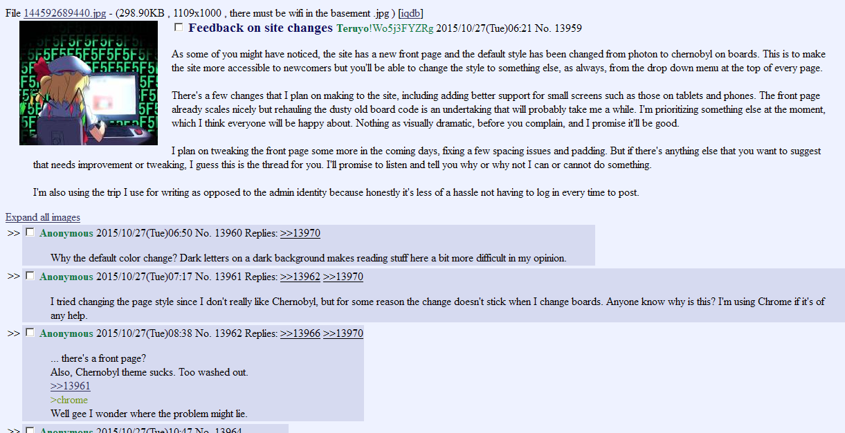
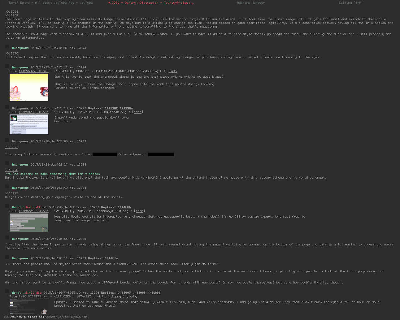

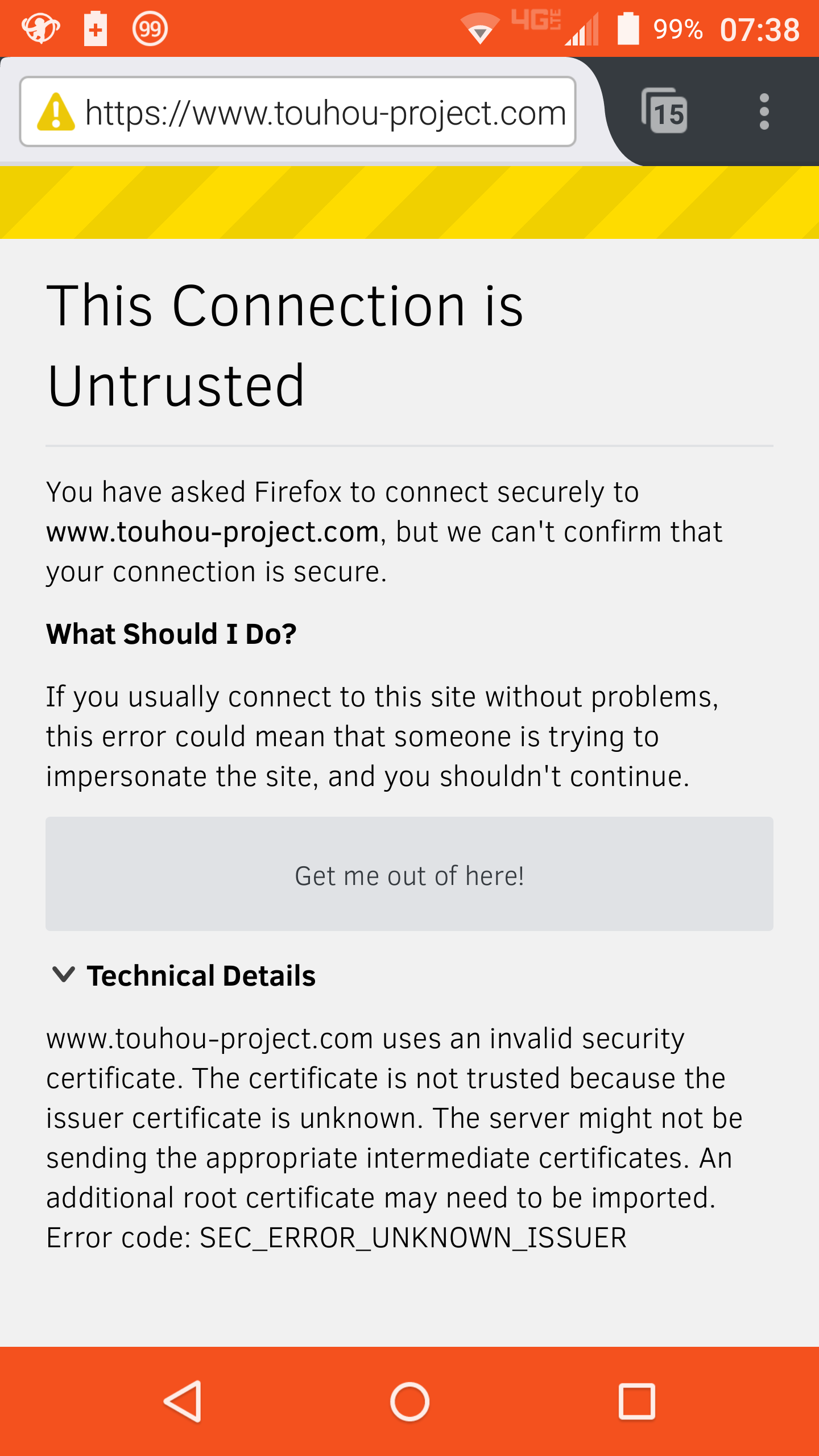


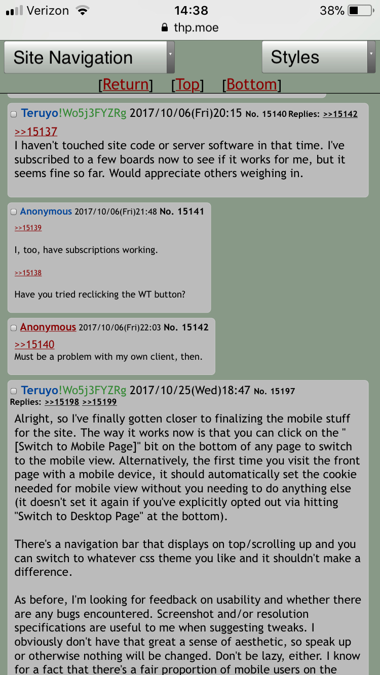

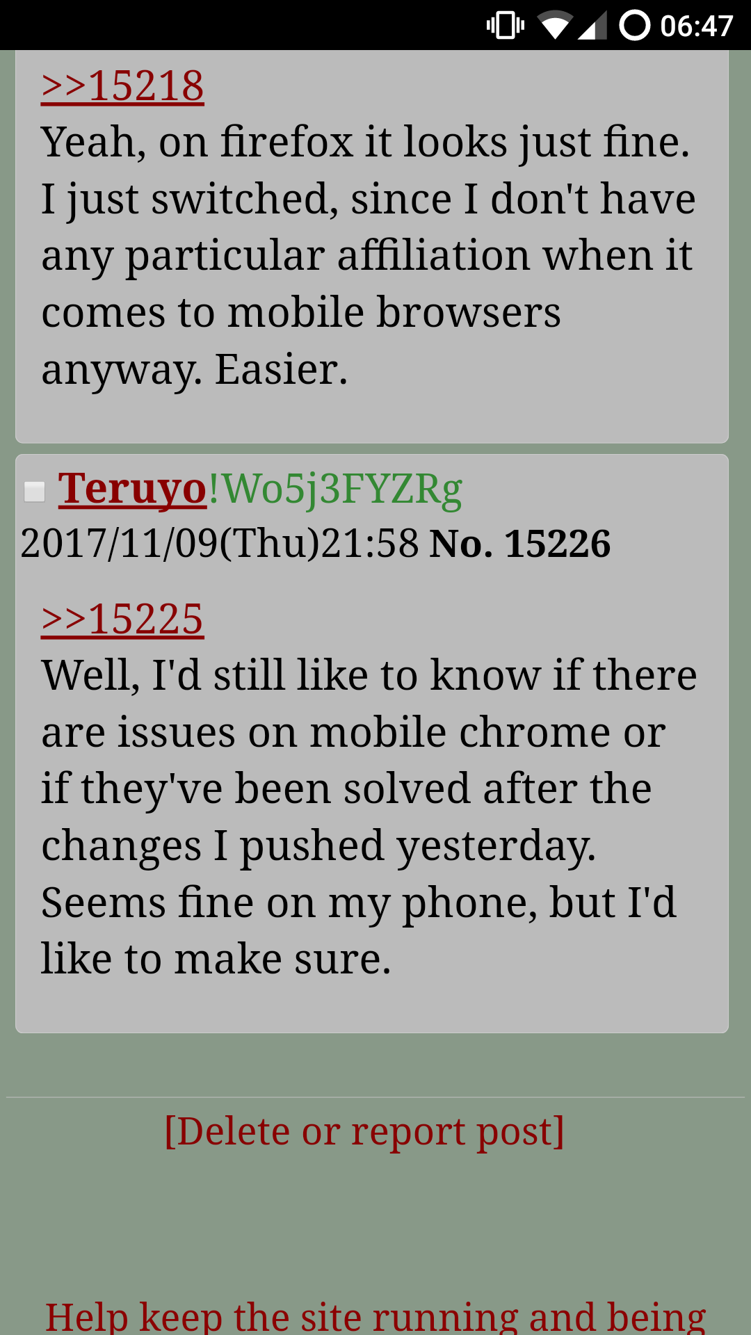


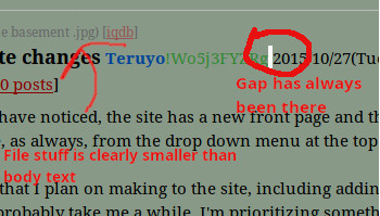


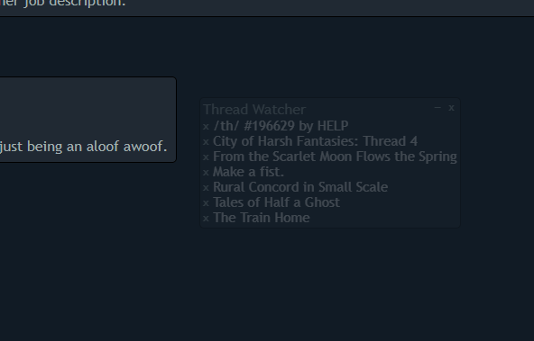
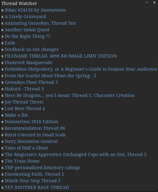
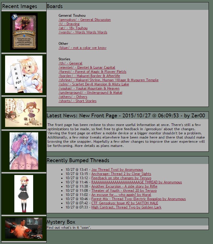
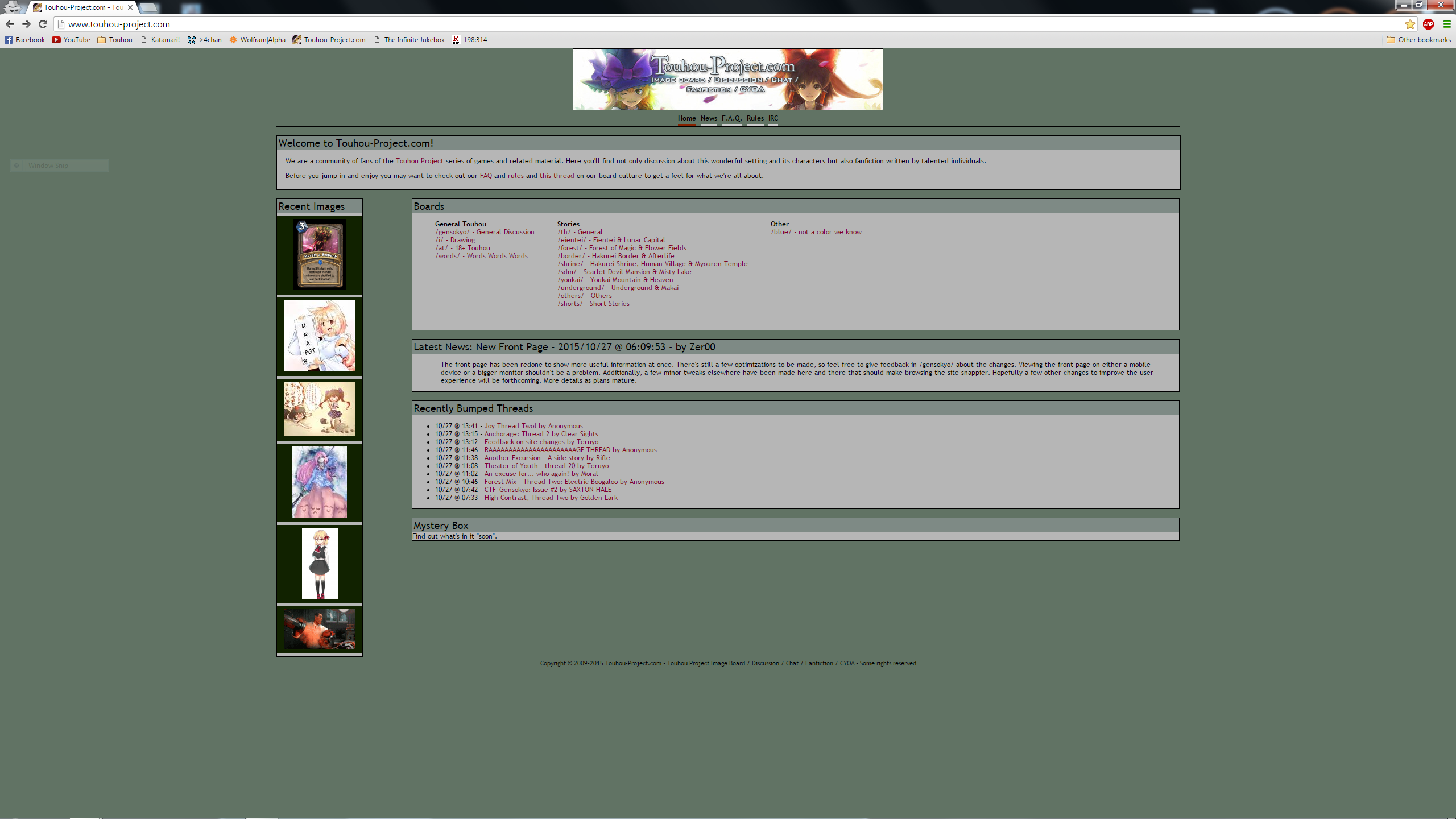
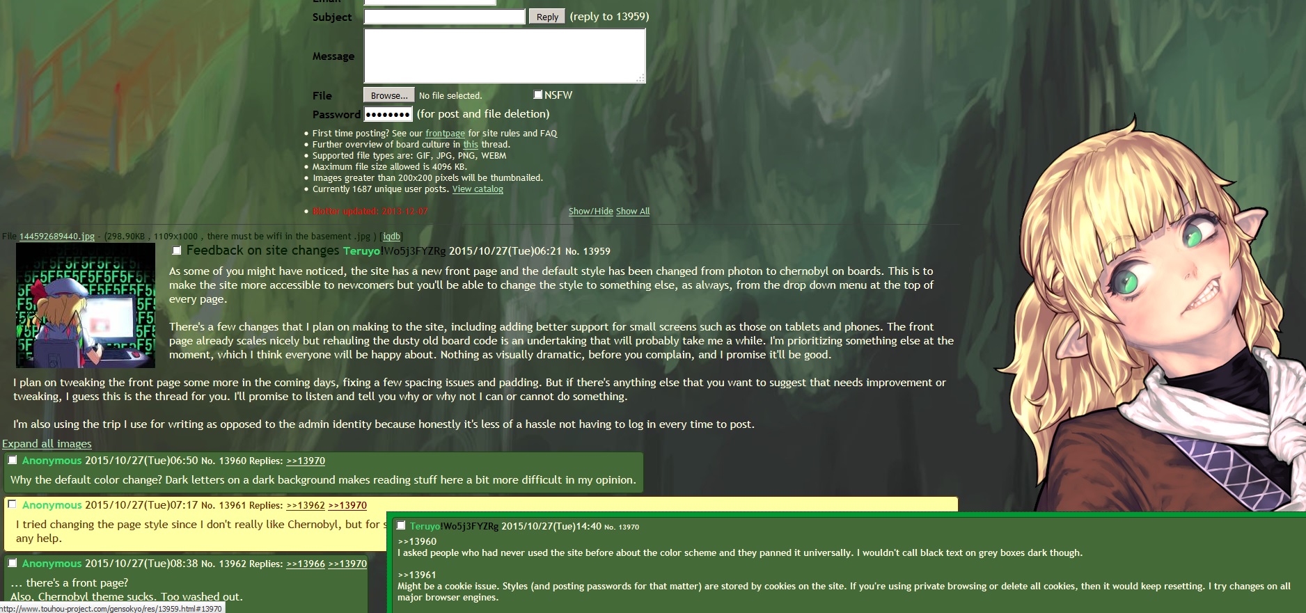

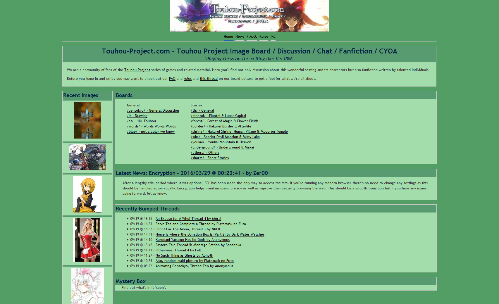


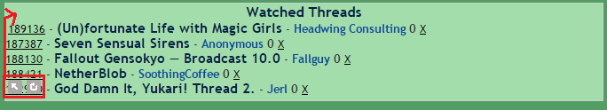
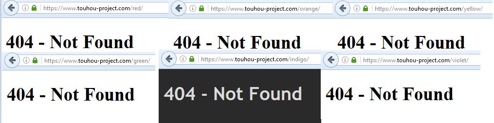
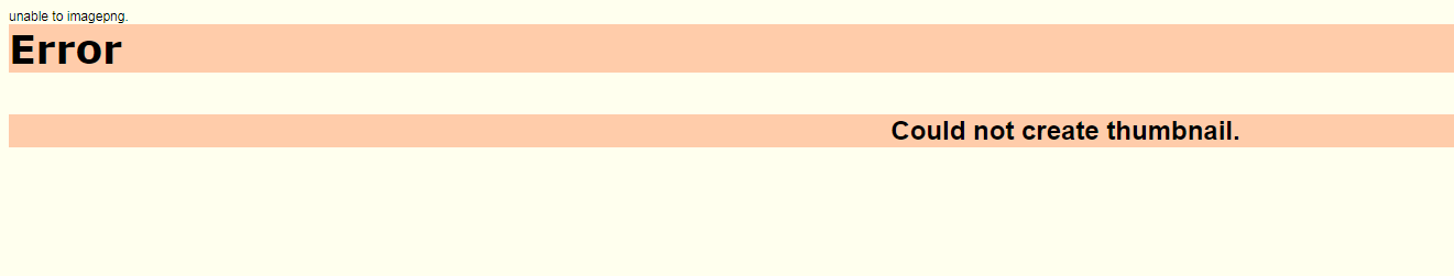
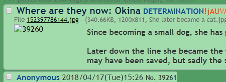